In recent weeks, we’ve discussed the rules of effective data visualization and the psychology of how our human brains interpret visual information — understanding how our brains interpret contrast, how cognitive overload hampers understanding, and the importance of text aligning with visuals.
But merely knowing the rules isn’t enough. Evaluating poor dataviz in practice truly brings these lessons to life.
That’s why we’re excited to introduce a three-part series where we analyze badly designed charts, explain their shortcomings, and demonstrate how to improve them.
Let’s start with an example that misses the mark with its use of contrast right from the beginning.
What’s Wrong with This Chart?
Take a look at this visualization titled “How Baby Boomers Describe Themselves.”
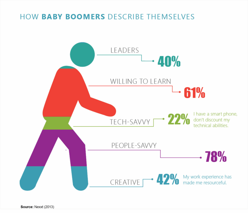
Sure it’s eye-catching, with its vibrant colors and a human figure segmented and labeled. However, the design elements undermine the effectiveness of the information presented.
The Relativity Rule: Parts Must Add Up to 100%
Let’s start by examining the visual pattern showcased in this data visualization: relativity. This concept involves observations made in relation to or proportionate with something else. The foundational principle here is that when a visual form displays parts of a whole, these parts must collectively equal 100%. If they don’t, the entire structure becomes unreliable, confusing the audience before they even interpret the numbers.
This is the primary flaw with the chart. The chosen visual form — an icon of a human — suggests that the figure represents a complete whole, yet the percentages allocated to different attributes sum up to 243%. This creates immediate confusion. If the human figure represents Baby Boomers as a group, how can it account for more than 100% of them?
The issue lies in how the data was collected—respondents likely selected multiple attributes, causing the totals to exceed 100%. What the chart actually shows is the prevalence of each attribute (the percentage of Boomers who selected it), not the relative proportion of Boomers who describe themselves with each trait.
However, when a visualization presents data within a single form, viewers naturally assume it represents a whole. To maintain clarity and accuracy, the values must sum to 100%.
Why This Matters: The audience’s mind processes relative visual shapes much like it does pie charts. When a shape is split into parts, these parts must collectively form a complete whole. If not, viewers might doubt the data’s accuracy instead of concentrating on the insights provided.
Fix: When data includes multiple responses from each individual (for example, if respondents can select more than one trait), it’s important that the visual representation acknowledges this fact. A grouped bar chart, where each category is shown separately, would be a much more suitable option.
After selecting the appropriate form, the next task is to implement it with contrast that clarifies, rather than muddles, the message.
Contrast: Why This Chart Fails to Guide the Eye
After we address the structural issue, we must ensure that the audience can easily comprehend the data. This is where contrast, a crucial principle of visual communication, plays a vital role.
Contrast helps us direct focus, emphasize important information, and ensure the audience notices the most critical elements first. Unfortunately, this chart misapplies contrast in three significant ways.
Size Contrast: When Proportions Don’t Match the Data
When size is utilized as a visual indicator, it needs to accurately reflect the values it represents, which isn’t the case here.
- The largest segment, People-Savvy at 78%, should stand out visually, but it doesn’t.
- The Creative section at 42% and the Leadership section at 40% have similar values yet don’t look visually equivalent.
- The Tech-Savvy section, at 22%, appears as large as the Creative section at 42%, leading to misleading comparisons.
Fix: If using size to represent data, ensure proportions accurately match the values. Otherwise, don’t use size contrast at all.
Color Contrast: When Everything Screams for Attention
The chart employs bold, vivid colors for each category, yet there’s no apparent rationale behind this choice. The outcome? Nothing is highlighted effectively.
Rather than focusing attention on important insights, the intense contrast throughout all sections diminishes the significance of any individual component.
Fix: Employ color contrast deliberately. By using a subdued base color and a highlight color, you can emphasize the key insight without having all the numbers vying for attention.
Shape Contrast: No Differentiation Between Categories
Each category is represented by a human figure, but is this form effective in conveying the data?
Currently, the chart uses only color to distinguish between categories. There are no differences in shape, texture, or symbols to assist the audience in swiftly recognizing distinctions.
Fix: Rather than squeezing all information into one human figure, employ various visual formats such as icons, clustered bars, or even a basic table to clearly differentiate categories.
Contrived Contrast: When Extra Elements Add Confusion
The notes on the right add character, but do they make the data clearer? Not particularly. Instead, they distract from the essential insights without providing valuable context.
Fix: When using annotations, they should enhance the primary insight rather than divert attention from it.
How to Get Dataviz Right
This example serves as an excellent reminder: Contrast is not merely about making things look different; it’s about directing the audience’s attention.
First, select the appropriate format—If your data comes from multiple responses, avoid using a stacked format that suggests parts of a whole.
Use size contrast properly—When representing data, it should be proportional. Otherwise, avoid using size as a tool for encoding information.
Apply color contrast wisely—Emphasize the most critical insights rather than giving everything equal prominence.
Incorporate shape contrast—Don’t depend solely on one visual cue, such as color. Use icons, textures, or layout to enhance meaning.
Be deliberate with annotations—Ensure that additional elements enhance clarity rather than create confusion.
When relativity and contrast are applied effectively, insights become apparent. When misused, audiences face difficulties, leading to inevitable misinterpretation.
Next week, we’ll explore another typical data visualization error: cognitive overload resulting from an unclear use of titles, headlines, and labels. Prepare for an illustration where excessive information overwhelms the core message and leaves the audience grasping for its meaning.
Until then, take a critical look at your own charts and Keep Analyzing!