In our ongoing investigation into what makes bad data visualizations truly criminal, we’ve examined violations of Contrast and Clear Meaning. Today, we turn our attention to the final principle in our framework for effective dataviz: Refined Execution — the design discipline that ensures your charts are polished and free of distraction.
Refined Execution is about visual craftsmanship. It ensures that font choices, lines, shapes, spacing, and color harmonize to present your data with clarity and elegance. When these elements are mismanaged (or worse, ignored) even great data can fall flat.
This week, we investigate a visualization that’s all chaos from the start — tangled, noisy, and lacking the polish good design demands.
The Anatomy of a Messy Chart
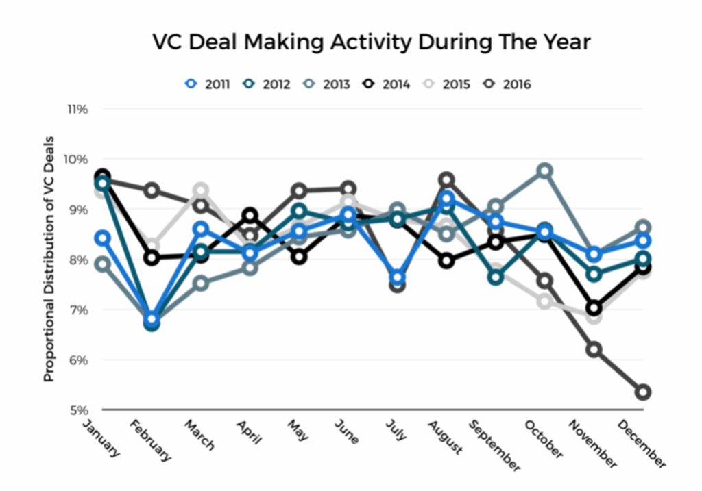
Here’s this week’s offender: a chart called “VC Deal Making Activity During The Year” which tracks the monthly distribution of deal volume across six different years. At a glance, it’s a mess. Six lines. Six colors. Slanted labels. Thick outlines. Circle data markers that turn the whole visual into what appears to be a bowl of SpaghettiOs! It’s not just overwhelming — it’s disorienting.
To understand where it goes wrong, we’ll assess the scene using the final principle of effective data visualization: Refined Execution.
This principle is about clarity through craft. When executed well, charts fade into the background and allow insight to take center stage. That clarity comes from attending to four specific design elements: lines, shapes, space, and color.
Let’s examine the evidence.
Failure 1: Chaotic Lines Obscure the Insight
At first glance, this chart feels chaotic. Six thick, jagged lines cut across the space, each rendered in a different color, each fighting for attention. The result is not clarity — it’s noise.
And that’s the core failure here: the lines are presented as if they all matter equally. But they don’t. One year — 2016 — stands out for a reason. Its sharp end-of-year decline is the real story. The other years simply provide context. Instead of using the lines to reveal that insight, the chart overwhelms the viewer with an indiscriminate tangle of data. It shows data for data’s sake, rather than guiding the audience to the meaning within the data.
The clutter continues in the labels. Month names are angled diagonally, an awkward choice that pulls attention away from the data and makes reading less efficient. We read best along a horizontal plane; rotated text slows comprehension and, worse, draws attention it doesn’t deserve. Labels should support the chart — not steal the spotlight.
Fix:
- Pull the story from the lines. Highlight the one line that matters — 2016 — and fade the rest into the background. This makes the narrative clear and the contrast intentional.
- Simplify and smooth the linework. Remove distracting data markers, reduce stroke weights, and eliminate jagged angles that draw focus away from overall patterns.
- Orient all text horizontally. This improves readability and removes unintended emphasis from the labels, keeping the viewer’s attention where it belongs — on the data.
- Use consistent, professional typography. Stick to a single font style and size to minimize distraction and reinforce visual polish.
Failure 2: Decorative Shapes Dilute the Message
The core shape in this visual — the line — is appropriate. Line charts are well-suited for showing trends over time. But the effectiveness of that choice is undercut by the clutter of additional shapes that add nothing and, worse, steal attention.
Circular data markers are scattered across each line, turning the chart into a tangle of spaghetti and meatballs. These shapes don’t clarify the trends — they distract from them. When the shape of the line itself carries the story, markers only obscure the path. The result is visual noise where there should be visual flow.
The confusion continues with the legend. Rather than labeling lines directly, the designer forces viewers into a matching game — glancing up at the legend, then down at the lines, then back again — adding unnecessary cognitive load.
Fix:
- Remove the data markers. Let the curvature of the line tell the story. Adding decorative shapes does more harm than good when they don’t serve a clear purpose.
- Use direct labeling. Label the one line that matters — 2016 — within the chart itself. This eliminates the need for a legend and speeds comprehension. (A principle we covered in Chart Crime Scene: Part 2.)
- Use line shape to tell one story. If 2016 is the deviation worth exploring, let that line carry the message. Subdue the others so the focus is unambiguous.
Failure 3: Sloppy Spacing Undermines Readability
The spatial layout of this chart feels like an afterthought. The y-axis is cramped, with its label awkwardly rotated and tucked to the side. The months along the x-axis are tilted — a classic signal that the layout couldn’t accommodate them properly. And the legend floats above the chart, visually disconnected from the data it’s meant to explain.
None of these choices support clarity. Instead, they force the viewer to work harder—not because the data is complex, but because the design is undisciplined.
Fix:
- Reconsider axis label placement. Rather than rotating text along the y-axis, place the label horizontally above the vertical scale. It saves space and improves readability.
- Avoid tilted labels altogether. If you’re running out of room, adjust spacing — don’t compromise legibility by rotating text.
- Create consistent spacing throughout. Balanced margins around the chart frame and between elements give the visual room to breathe and help the structure feel deliberate.
Space is a design element in its own right. Use it wisely, and your chart will feel composed — rather than crammed.
Failure 4: Color Usage Muddies the Message
In this chart, every line is assigned its own color — six in total — yet none of them truly stands out. The palette is a muted mix of blues, grays, and blacks, with no clear visual hierarchy. There’s no dominant hue to draw the eye. No contrast to anchor the message. The result is visual equivalence across all years, which might seem fair from a data neutrality standpoint, but it’s a failure in storytelling.
If your goal is to highlight a particular insight — say, that 2016’s year-end drop broke from historical norms — then the design needs to reflect that emphasis. Right now, the chart is visually impartial, and that neutrality leaves the viewer unsure of where to look or what matters most.
Color is not decoration. It’s direction. And in this case, it’s directionless.
Fix:
- Use color to create visual hierarchy. Choose one color — ideally a bolder, higher-contrast tone — to represent the focal data (e.g., 2016), and relegate the other lines to lighter, desaturated tones that fall into the background.
- Apply saturation with intent. A bright, saturated red or orange will immediately command attention. Muted grays and soft blues can signal supporting context without competing visually.
- Reduce the palette, increase clarity. A limited set of purposeful colors does more to tell a story than a full spectrum of indistinguishable hues. Every color used in a chart should earn its place.
When color is used with precision, it not only beautifies — it clarifies. It tells your audience, “Look here first.”
Final Verdict
This chart suffers from a death by distraction. Too many thick lines. Too many indistinguishable colors. Sloppy text placement. No focal point. All of it adds up to a single outcome: the insight is lost.
Refined execution is what elevates a chart from functional to exceptional. And it’s often the difference between “I don’t get it” and “Aha!”
When you build your next visualization, remember:
• Lines should be simple, smooth, and purposeful.
• Shapes should clarify, not complicate.
• Space should breathe — not crowd.
• Color should lead the eye, not confuse it.
As you go forward in your data storytelling practice, remember to keep it clean, keep it crisp, and above all … Keep Analyzing!