I am — unashamedly — a huge fan of David McCandless.
The British data-journalist and information designer is the founder of the visual blog Information Is Beautiful and author of several books on data visualization. His analysis is insightful, his visualizations sublime. In my opinion, he sets the bar for dataviz to which all analysts should aspire.
While visualizing data like David McCandless may be “a bridge too far” for many analysts starting out, there is a tremendously important skill that we can learn from him straightaway: the manner McCandless presents his data visualizations to an audience.
The style in which we stand on our feet and present our visuals – what is typically the last few yards of a long and arduous analysis journey – is very important. If we make our narrative too complicated for audiences to follow or if we fail to properly express the substance of our work, we run the risk of losing our audience. At that point, all the hard work we’ve done leading up to that moment — planning our analysis, finding data, analyzing that data, and pulling out its story — goes to waste.
How analysts present their data stories can have as much effect on audience understanding as the content
Luckily, a simple process helps analysts present data stories effectively. Performing each step in the proper sequence allows analysts to communicate insights clearly, focusing audience attention on their work. Indeed, the proper approach to presenting graphics can be a learned behavior.
‘The McCandless Method’ of Data Presentation
Studying the way David McCandless presents dataviz reveals a consistent set of steps analysts can use to lead audiences through data stories. From this study, I’ve developed a process I call The McCandless Method. This five-step process is based on the successful way he has presented data visualizations.
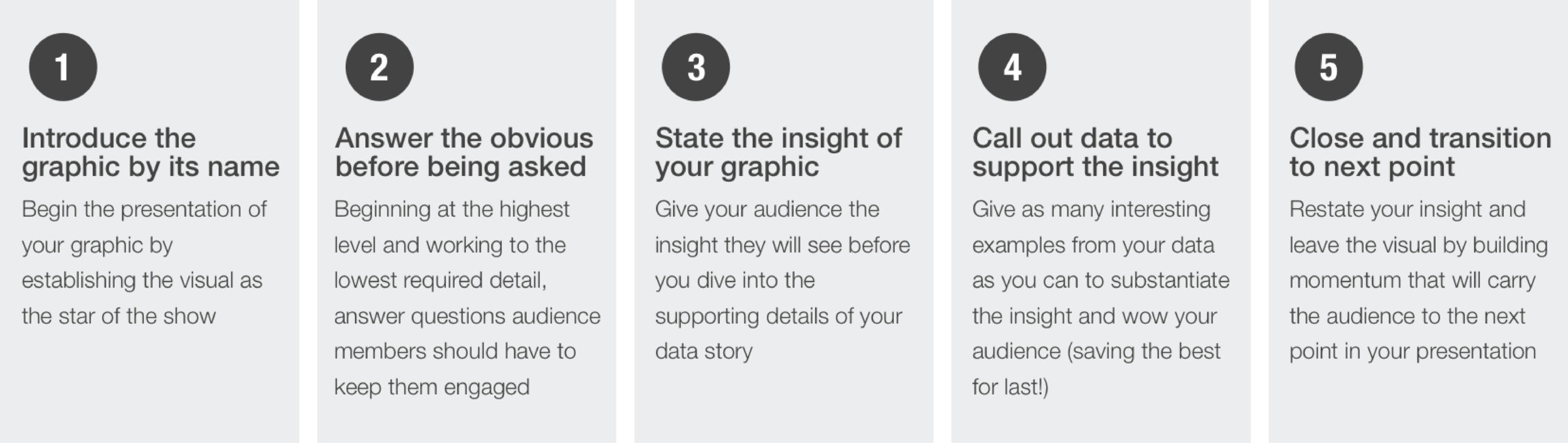
Introduce the graphic by name, allowing audience members to focus their attention on the graphic rather than you
Step 1: Introduce the Graphic by Name
The first step in The McCandless Method is to introduce the graphic by name, allowing audience members to focus their attention on the graphic rather than you. The name should be clear, unadorned, and obvious. Ideally, the name should be the chart headline (see my book Digital Marketing Analytics: In Theory And In Practice, available on Amazon for more direction on using chart headlines). Often, analysts will give their charts clever names to make them memorable, but the names don’t set up the stories. Seasoned analysts can use this technique, but novices should stick to easy-to-comprehend chart names.
Answer the obvious questions before the audience has to ask them
Step 2: Answer the Obvious Questions
The second step in The McCandless Method is to answer the obvious questions that will jump to audiences members’ minds before can ask those questions. By doing so, analysts can minimize possible confusion and ensure audiences pay attention to analysts’ stories rather than try to decode chart elements.
As analysts share their presentations, they can identify the questions people will likely have. The more experience analysts have in presenting charts (formally or informally), the more adept they’ll become at identifying elements that require explanation. Obvious questions analysts should address immediately include what contrast – color, size, shape, or contrived – means in the graphic, what data is presented (i.e., the axis of the chart), and where the data came from.
Give away the insight before you’ve built your case…don’t make the audience wait or figure it out for themselves!
Step 3: Give Away the Insight
The third step in The McCandless Method is to state the insight from the graphic. An analyst should reveal their story by telling audience members what they’ll see (or feel) before they substantiate the insight. The audience may be curious, even disbelieving, at this point. By sharing the insight before diving into supportive facts, the analyst will benefit in two ways: (1) They can reveal an insight before they become distracted with facts and figures, and (2) Sharing the insight upfront paves the way for the analyst to deliver the supporting facts the audience seeks. The insight the analyst should reveal is the chart’s subtitle (see Lesson 3 for tips on chart subtitles).
For years, I presented my evidence patiently and dutifully before revealing (with great aplomb) the insight of my analysis. I believed that by building tension and methodically constructing my story, I was guiding my audience down the primrose path of my logic to its dramatic conclusion.
Eventually, I learned it didn’t matter how airtight my story was or how memorable my facts were. The longer it took me to reveal the insight, the less likely it was that I had my audience’s attention. Sometimes, the mounting body of evidence overwhelmed people, leaving them unable to concentrate in the critical moment of my big reveal. Other times, someone disagreed with a fact I delivered, causing that person to shut down and disregard what I said next.
When I reversed the order of my story from “evidence → insight” to “insight → evidence” my presentations became more effective than ever.
Substantiate your insight by providing supporting examples in the data
Step 4: Provide Examples
Once the analyst establishes the conclusion they want the audience to reach, they can provide the substantiation the audience will crave by providing examples. The order in which the analyst delivers their evidence is important and should be done in a way that facilitates agreement from the audience. The analyst can do this by moving hard-hitting facts to the beginning of their narrative when facing a skeptical audience. This will allow the presentation to start off on a high note and earn momentum for the evidence that follows. If the audience is friendly, the analyst has the latitude to present evidence in a way that ends with a dramatic, “no doubt about it” fact that is as entertaining as it is illuminating.
Close the visual by building momentum for the next point in the presentation
Step 5: Close
Finally, it’s important to transition to the next point in the presentation. Foreshadowing the next point (e.g., “on the next slide you’ll see something even more amazing”), calling out a fact that links to something on the next slide (e.g., “I’ve shown you that 90 percent of U.S. adults visit YouTube each month – that will be important context for our next slide”), or telling audience members why the graphic matters to them (e.g., “This is important because it represents a new opportunity for your company to increase household penetration”). Close the presentation of your visual in the way that fits your needs and continues the momentum to the next topic of discussion.
The McCandless Method will set you up for a successful presentation. It will ensure you present data in the right way. It’s important for you to build that method into your practice. You should also build other critical habits into your practice of presenting graphics, but the basic guidelines presented here will help ensure your presentation is successful.
You can learn more about this topic, including a case study of The McCandless Method in practice, in my book Digital Marketing Analytics: In Theory And In Practice, available on Amazon.
“The power of Digital Marketing Analytics is that it provides an insightful approach to the art of analytics while demystifying its science…Kevin’s book is a fantastic resource for any marketer who wants to do more with data.”
Mike Clarke Director – Facebook