


Continue reading
You spent two weeks building it. You cleaned the data, structured the queries, perfected every filter, and polished every visual. You delivered the dashboard to your stakeholder, feeling proud. You gave them the keys to the kingdom. You empowered them. This is a mistake. That feeling of empowerment is an illusion. By delivering a dashboard, […]
September 10, 2025

Continue reading
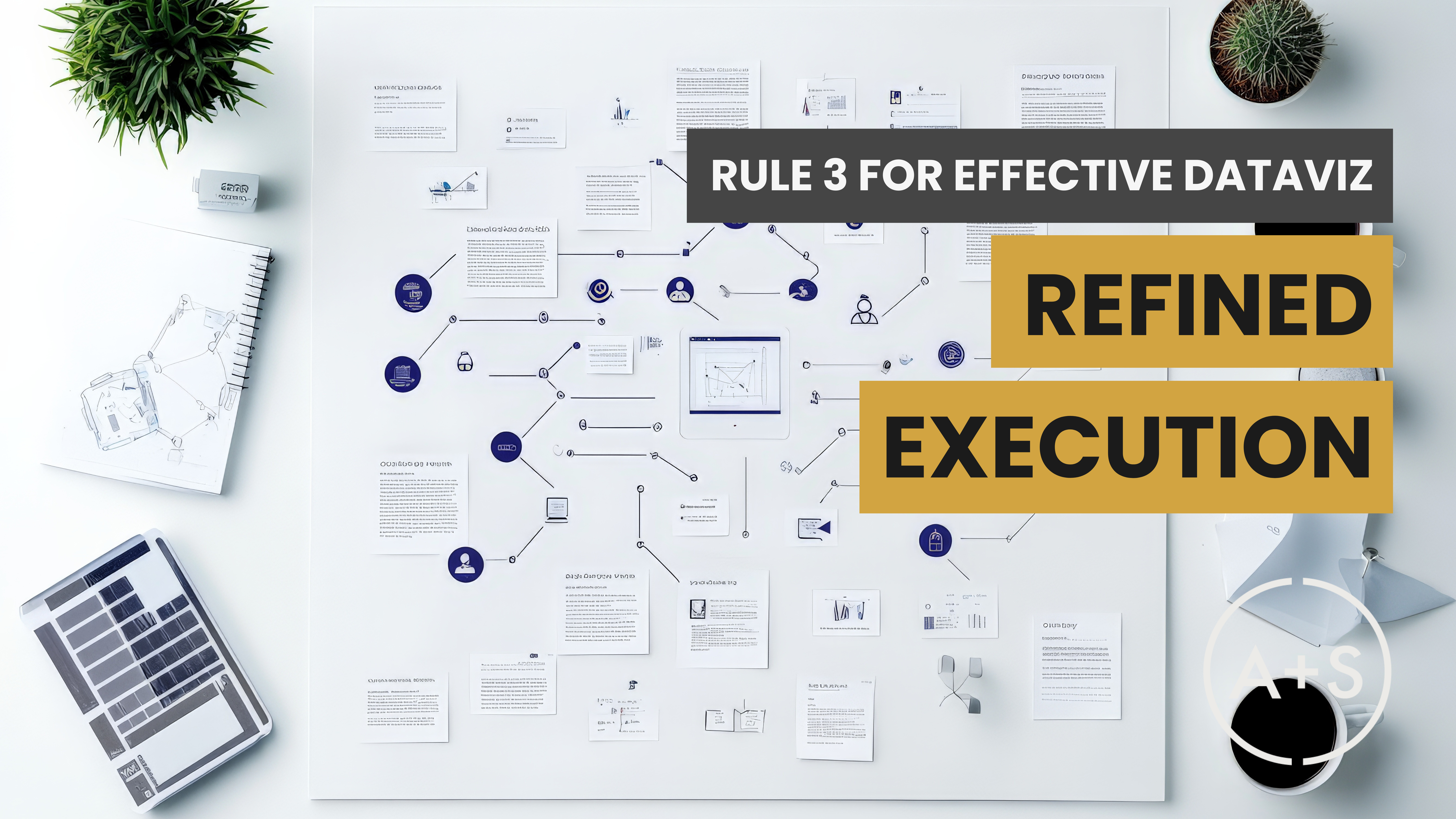
In our ongoing investigation into what makes bad data visualizations truly criminal, we’ve examined violations of Contrast and Clear Meaning. Today, we turn our attention to the final principle in our framework for effective dataviz: Refined Execution — the design discipline that ensures your charts are polished and free of distraction. Refined Execution is about […]
March 26, 2025

Continue reading
Last week, we explored contrast — the visual hierarchy that directs attention and makes key insights pop. This week, our focus turns to Clear Meaning, the second principle in effective data visualization. A thoughtfully designed chart does more than just display data; it guides the viewer to the intended message. The goal is to ensure […]
March 19, 2025

Continue reading
In recent weeks, we’ve discussed the rules of effective data visualization and the psychology of how our human brains interpret visual information — understanding how our brains interpret contrast, how cognitive overload hampers understanding, and the importance of text aligning with visuals. But merely knowing the rules isn’t enough. Evaluating poor dataviz in practice truly […]
March 12, 2025
Continue reading
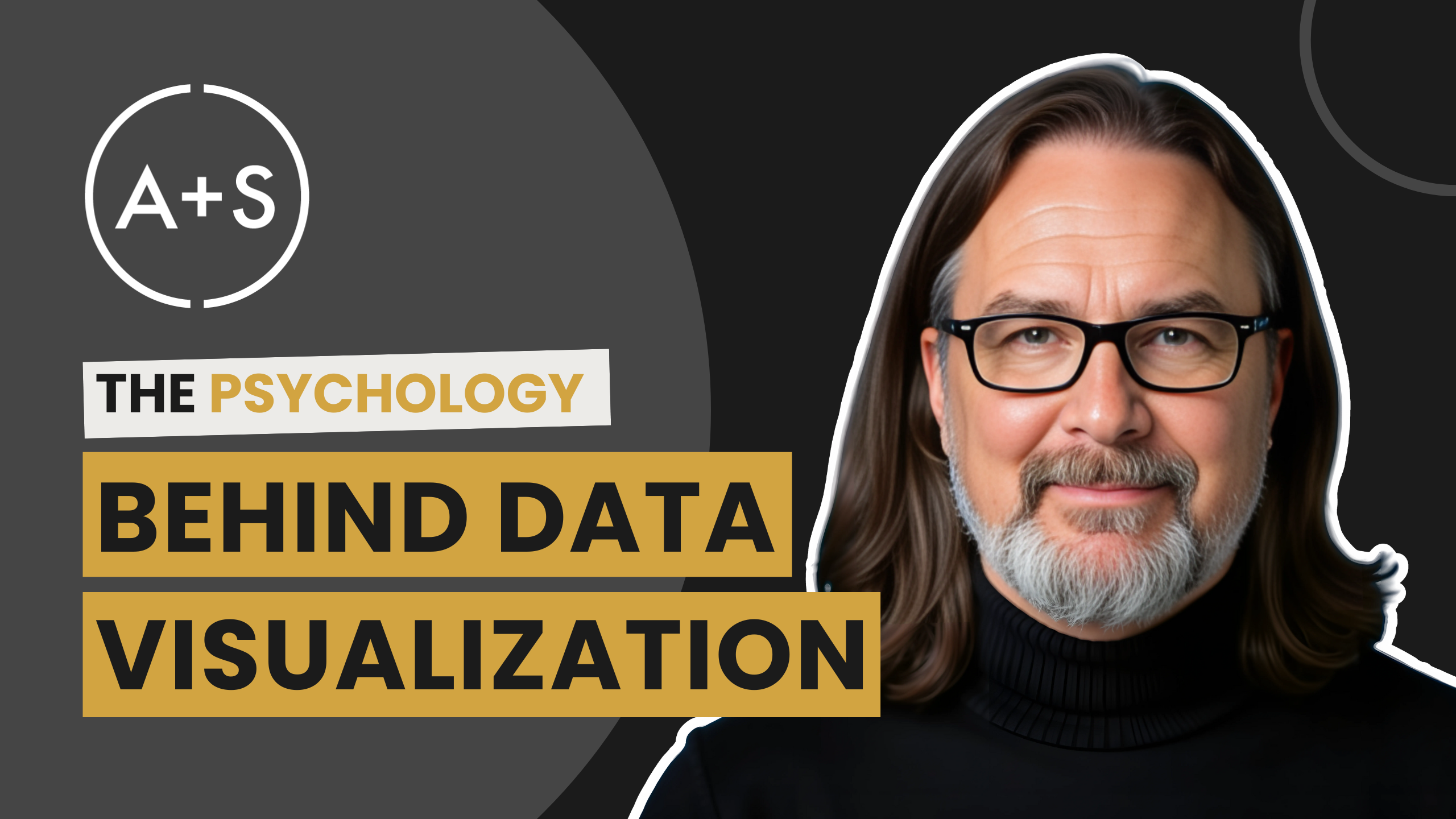
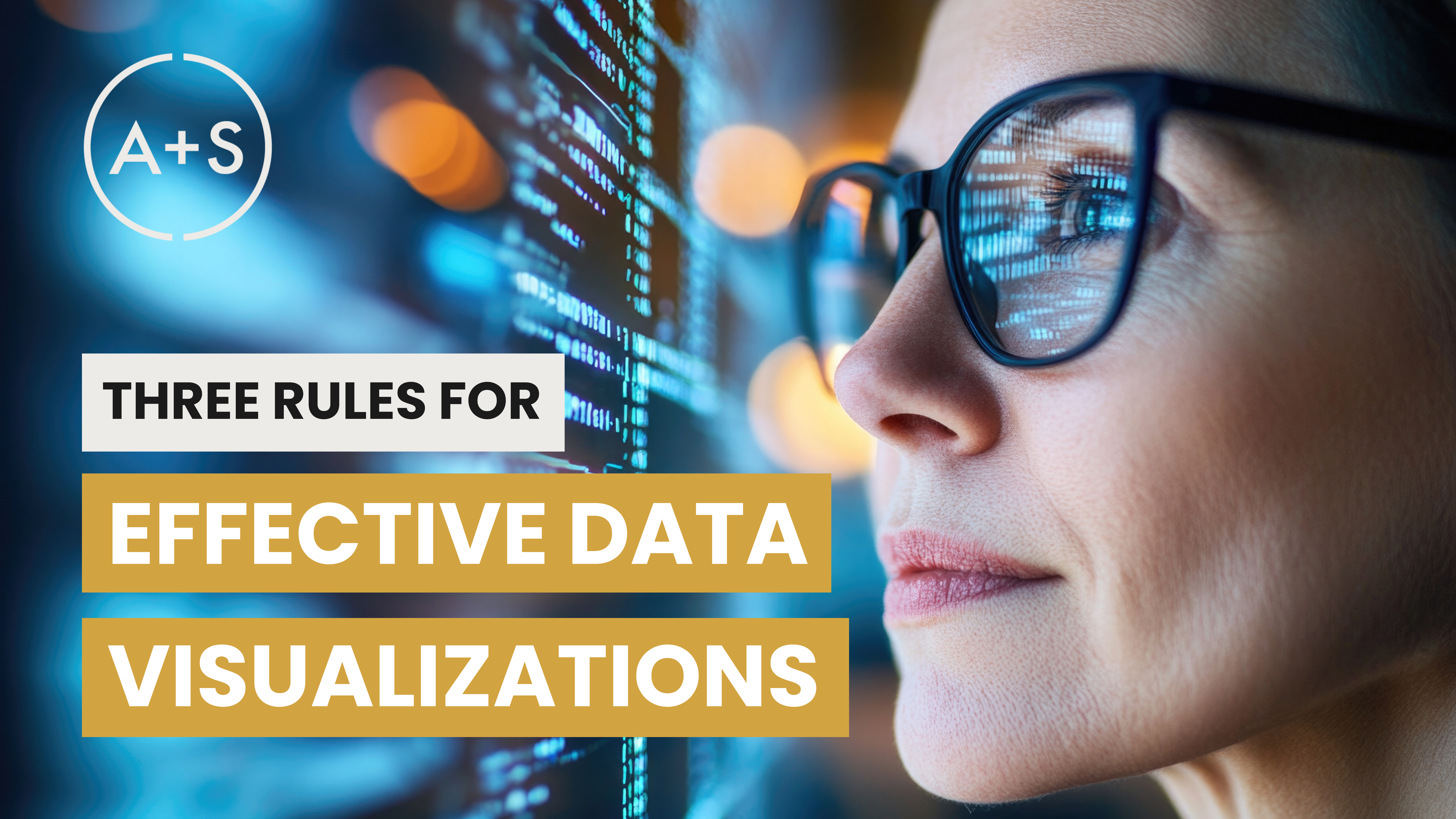
Over the past few weeks, we’ve explored the three core principles of effective data visualization: But why do these principles work? What is it about the way our brains process visuals that makes some charts stick and others disappear into the void? This week, we’re diving into the psychology behind great data visualization. Specifically, we’ll […]
March 5, 2025

Continue reading
Oscar week is upon us, and on Sunday, March 2, 2025, the 97th Academy Awards will once again honor the very best in film. However, as Hollywood gears up for its most anticipated evening, it’s worth revisiting one of the most notorious Oscar mishaps — the 2017 Best Picture mix-up. That startling error wasn’t simply […]
February 26, 2025
Continue reading
Today, we wrap-up our review of the three rules for effective dataviz by learning how to minimize distractions through a refined execution of key design principles. We’ll dive into why polished visuals and meticulous attention to detail are crucial for creating data visualizations that grab your audience’s attention, effectively convey your message, and appear pleasing […]
February 19, 2025
Continue reading
We continue our look at the three rules of effective data visualizations by examining the clear expression of a chart’s meaning through the proper use of common elements. Now, the groundwork for crafting effective messages with charts starts at the beginning of the data analysis process. By establishing a clear goal, collecting pertinent data, and […]
February 12, 2025
Continue reading
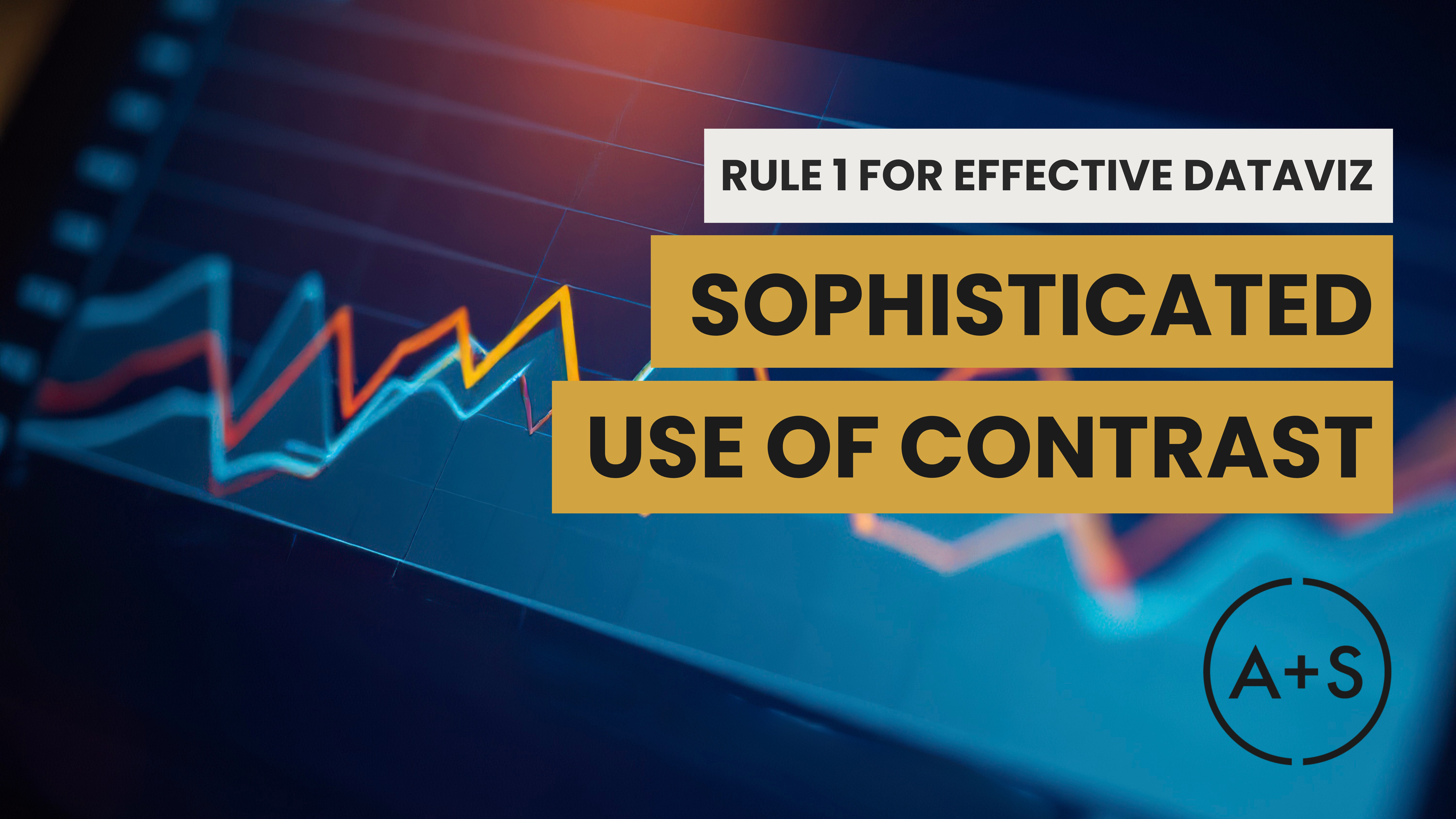
We begin our deep-dive into the three rules of effective data visualizations by examining the sophisticated use of contrast. Utilizing contrast is a crucial tool for analysts to engage their audiences immediately. By utilizing preattentive attributes, contrast can elicit quick reactions in the brain while keeping the prefrontal cortex relaxed and calm. This allows analysts […]
February 5, 2025
Continue reading
So far this year, we’ve challenged you to improve your storytelling skills, equipped you with strategies for handling audience questions like a pro, and introduced you to three crucial tests for preparing your data visualizations for Prime Time. In this post, I aim to provide some insight into a fundamental concept that ties together all […]
January 29, 2025


Download your comprehensive 6-month roadmap to equip you with the necessary skills and expertise to become a proficient data analyst candidate and succeed in the field.
Getting Your Data Analyst Career Up And Running: Your 6-Month Starter’s Guide
download


