Last week, we explored contrast — the visual hierarchy that directs attention and makes key insights pop. This week, our focus turns to Clear Meaning, the second principle in effective data visualization.
A thoughtfully designed chart does more than just display data; it guides the viewer to the intended message. The goal is to ensure that the audience understands the main point with minimal cognitive effort.
When a chart lacks clear meaning, it typically does one of two things:
- It bombards the viewer with excessive noise and irrelevant details that drain mental energy.
- It offers too little information, forcing the audience to work hard to extract meaning.
Neither is outcome is good as both lead to misinterpretation and detachment.
A Chart That Raises More Questions Than It Answers
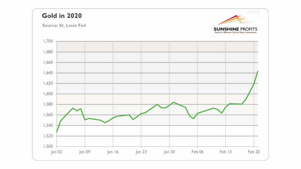
Consider our this offending dataviz — a chart called “Gold in 2020.” At first glance, it’s clear that this chart is presenting data related to gold … but that’s about the only thing of which we can be sure. A closer look reveals crucial omissions that strip the chart of clarity and require the audience to do extra work.

Let’s break it down.
Issue 1: Bad Title, Missing Headline, Unclear Message
As we’ve discussed, while data visualization primarily involves visuals, text plays a vital role. Clear titles, headlines, and labels are essential for ensuring that your audience understands and retains the information conveyed.
The title is usually in the largest font and is the first thing the audience notices. A chart title guides the viewer by indicating what the chart represents. It must clearly answer the initial question that arises for anyone viewing a dataviz: “What am I looking at?”
The chart’s headline communicates the key insight, making sure the message is clear even without an analyst’s explanation. Together, these elements form the foundation for audience understanding.
In this case, the chart title is too generic and the headline is missing. The only thing the audience has to orient itself is a too brief, ambiguous phrase: “Gold in 2020”.
Is this chart tracking gold’s price, supply, mining volume, or investor holdings?
Is the data presented in daily, weekly, or monthly increments?
Does the chart cover the entire year or just a segment?
The end result is an unclear story that leaves the audience guessing. A well-crafted headline serves as the analyst’s voice, conveying the insight when further explanation is absent. Perhaps the creator of this visual could have offered an elegant story that aligned with the data and made the whole thing make perfect sense. But, as is usually the case, they are not here with us. The poorly written title and absence of a headline means we’ll never know their intended message.
How to Fix It:
- Refine the title to specify what is being measured and the timeframe. For instance, rather than using the title “Gold in 2020,” a clearer description for the chart would be “Gold Prices in Early 2020,” as this immediately informs the audience about the chart’s content.
- Add a clear headline that states the main takeaway. Even though we have minimal guidance to interpret the chart’s insights, my guess is that it depicts gold prices in a time when the shadow of the global COVID-19 pandemic touched everything. Hence, a headline presenting an insight such as “Gold Prices Surge as COVID-19 Fears Drive Investor Demand” would fit and provide the audience with the chart’s key meaning.
These small tweaks immediately set the proper context, reduce cognitive load, and allow the audience to engage with the data without confusion or delay.
Issue 2: Confusing Labels Force the Viewer to Guess
Labels bridge the gap between raw data and comprehension. Without them, viewers must infer relationships on their own, adding an unnecessary burden that slows understanding.
This chart falls short in several key areas:
- The y-axis is unlabeled, leaving the viewer to assume the numbers represent gold prices. But can we be certain without a currency symbol? And if these are indeed prices, what currency are they in?
- The x-axis fails to clarify if the data points are daily closing prices, weekly averages, or something else.
Instead of making insights obvious, the chart forces the viewer to piece the information together, resulting in cognitive overload.
How to Fix It:
- Clearly label the y-axis with “Price per Ounce (USD).” And, for goodness sake, add a dollar sign to the numbers.
- Specify the x-axis with “Daily Closing Prices (Jan-Feb 2020)” to define the timeframe and frequency of data.
These improvements ensure that the chart’s meaning is instantly accessible.
Issue 3: Lack of Annotations to Explain Key Trends
A chart should do more than display data — it should also explain it.
Annotations provide context by highlighting important events, trends, or anomalies. Without them, the audience is left to guess the reasons behind certain trends.
For instance, the chart shows a noticeable spike in mid-February without any context. Was this surge due to investor anxiety over COVID-19, a policy change, or a market event?
A small bit of cursory research reveals that:
- The initial spike in gold prices presented in the chart followed a January 4 World Health Organization report on social media that there was a cluster of mysterious pneumonia cases in Wuhan, Hubei province, China
- The second price jump in mid-January occurred after officials confirmed a case of COVID-19 in Thailand, the first recorded case outside of China
- The third increase in gold prices happened after the Washington State Department of Health announced the first COVID-19 case in the U.S. on January 21st; and
- The final surge in the price chart occurs during a one-week period that saw the largest drop in the S&P 500 since the 2008 financial crisis, the most notable decline in oil futures since 2009, and unprecedented low yields on 10-year and 30-year U.S. Treasury securities.
Yet without annotations, this critical contextual information is hidden from the audience. The viewer must work harder to infer meaning from raw data, increasing the cognitive load.
How to Fix It:
- This one’s simple: Include annotations to clarify major data movements. Any (and perhaps all!) of the snippets of information detailed above would have provided the contextual understanding the audience needed to validate the headline insight we’ve promoted (“Gold Prices Surge as COVID-19 Fears Drive Investor Demand”). In fact, the addition of these datapoints may even allow us to promote a more forceful insights, such as “Gold Surges as Pandemic Uncertainty, Market Turmoil, and Trillions in Economic Rescue Aid Shake Investor Confidence”.
These annotations help the audience grasp critical trends immediately and, most importantly, provide substantiation for the key insight we display in our headline.
Issue 4: No Visual Cues to Direct the Viewer’s Attention
A well-crafted chart actively guides the viewer’s focus, ensuring that the most important insights are noticed first. Visual cues — such as bolding, arrows, or reference lines — are essential for this.
In this chart:
- Every data point is treated equally, even though some changes are far more significant.
- The dramatic price increase in February isn’t emphasized, making it blend in with minor fluctuations.
- There are no reference markers, making it difficult to gauge the magnitude of changes.
Without these design elements, viewers are left without clear guidance on where to focus, or may inadvertently focus on less important details.
How to Fix It:
- Use contrast to emphasize critical trends, such as highlighting the February spike with a darker tone or bolding.
- Add a benchmark, like a horizontal line indicating the 2019 average price, for context.
- Subtly highlight key periods, for example by shading the weeks leading up to the February spike to indicate rising market volatility.
These modifications help direct the viewer’s interpretation instead of leaving them to search for meaning.
Final Verdict: Key Takeaways for Better Data Visualization
A well-constructed chart should eliminate ambiguity, guiding the viewer to a clear and accurate understanding of the data. Unfortunately, this chart does the opposite—it leaves viewers grappling with missing labels, an ambiguous title, absent annotations, and a lack of visual direction.
Addressing these issues would transform the chart from an unclear visual into a chart that is rich with insight and easy to understand.
To achieve this, ensure you incorporate the following when designing Clear Meaning in your charts:
- Minimize cognitive load by making sure the chart is immediately understandable.
- Include titles to orient the viewer and headlines to communicate the main insight.
- Ensure that labels remove all uncertainty.
- Apply annotations to tell the story clearly rather than leaving it implied.
- Use visual cues to direct attention so that key insights stand out.
Next week, we’ll dive into Refined Execution, where deliberate design choices can eliminate distractions while elevating your dataviz from merely functional to truly exceptional.
Stay tuned and Keep Analyzing!


