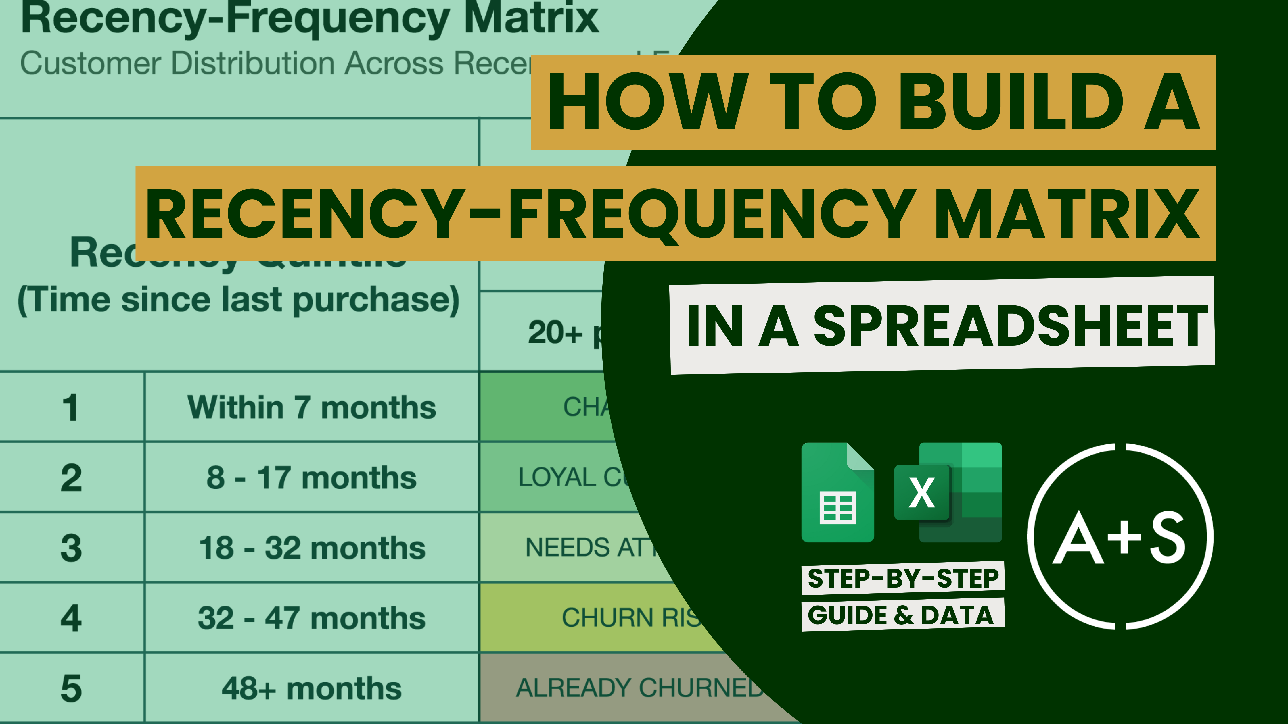
It’s time to get your hands dirty, because today we’re delving into the details of creating a Recency-Frequency Matrix using a spreadsheet. If you’ve been keeping up with our “My Favorite Analyses” series, you’ll recall that last week we talked about the value of the Recency-Frequency Matrix in dividing customers into groups and improving marketing strategies. Now, it’s time to put that knowledge to use with a step-by-step tutorial that can help you conduct this important analysis on your own transaction data.
Why A Spreadsheet?
Spreadsheets are versatile and user-friendly tools that are well-suited for small to medium size datasets. They offer the ability to conduct detailed analyses without requiring advanced software or coding, making them a great option for analysts who are new to Recency-Frequency segmentation. While Excel and Google Sheets have certain limitations — a maximum of 1,048,576 rows in Excel and a total cell limit of 10 million in Google Sheets — they still meet the needs of most businesses.
We are using Google Sheets because, as I have said, its online functionality is far superior to that of Excel’s online version (which, frankly, I really dislike). As will all of our tutorials, I have produced a step-by-step visual playbook using Guidde and a practice dataset. The most effective way for me to share that is through an online spreadsheet. Hence, Google Sheet is the tool of choice.
Note that in this tutorial, I will demonstrate how to create your own Recency-Frequency Matrix using functions that are likely already familiar to you. There are far more complex and sophisticated ways to conduct this analysis but, for now, we’re laying out the basics.
What You’ll Need
Before we jump into the steps, here’s what you’ll need to get started:
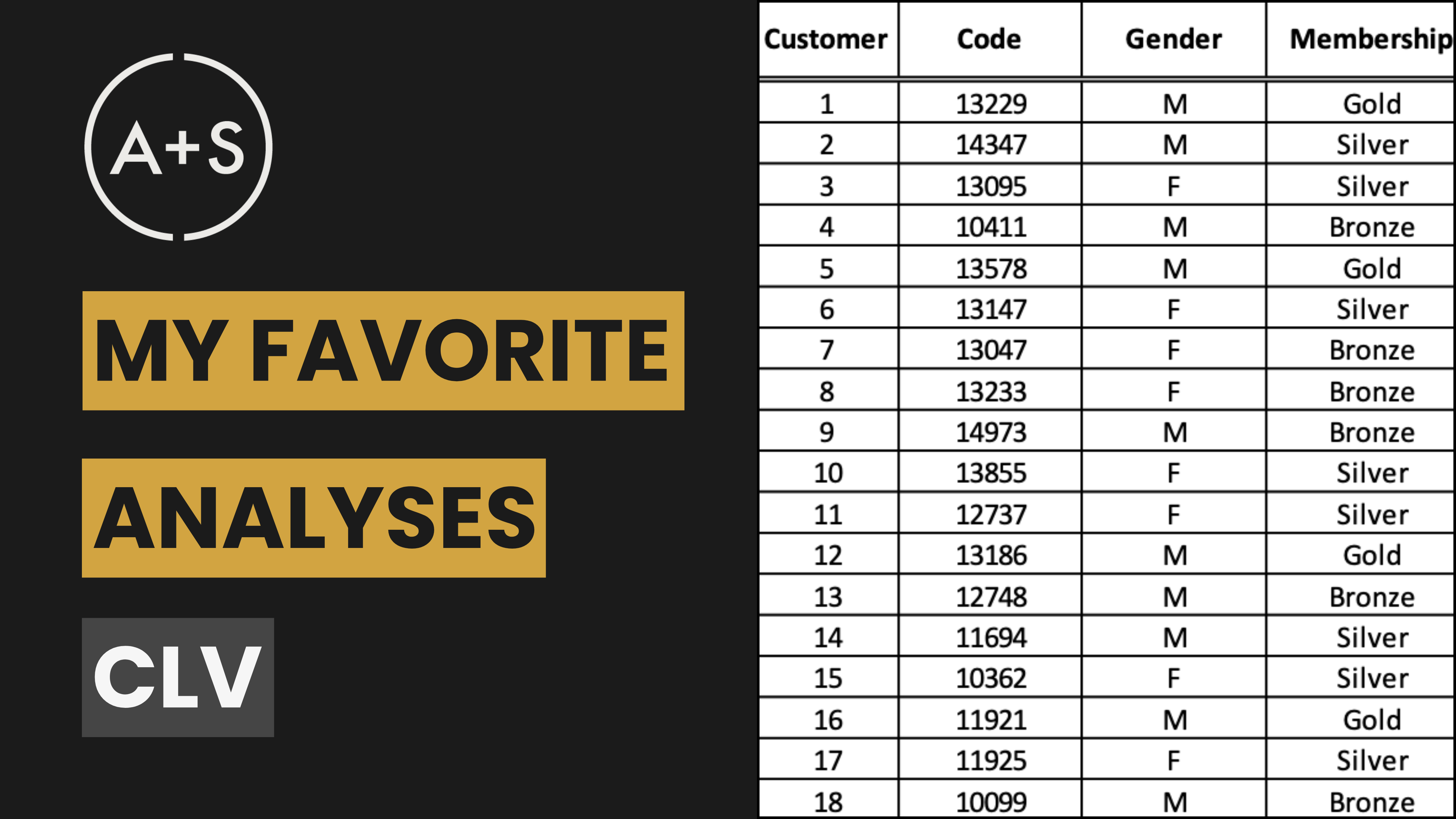
- A Transaction Log: This is your unprocessed data, usually containing columns for Customer ID, Transaction Date, and other information like Purchase Amount. The more comprehensive your transaction log is, the more depth you can bring to your analysis. However, only Customer ID and Transaction Date are required to build a Recency-Frequency Matrix. (As mentioned above, if you don’t have access to a transaction log you will find a practice dataset here).
- Google Sheets or Excel: We’ll be using Google Sheets for this tutorial, but the commands and functions are also applicable to Excel. Upload your transaction log and you’re ready to go.
Step 1: Prepare Your Data
Before diving into calculations, the first step is to set up the “Customer Summary” table, which will aggregate your transaction data by customer. This table will be used to calculate our Recency and Frequency metrics.
Here’s how to set up your Customer Summary Table:
- Insert a Pivot Table:
- Go to your original transaction log tab and click on any cell in your data.
- Go to the menu and select Data > Pivot Table.
- In the Pivot Table editor, choose to place the Pivot Table in a new sheet (this option automatically creates a new tab for you).
- Set Up the Pivot Table:
- Rows:
- Add customer_id as the row label.
- This will aggregate all transactions by each customer.
- Values:
- Add transaction_date to the values and set the “Summarize by” option to MAX to find the most recent purchase date.
- Next, add transaction_date a second time to the values, but this time set “Summarize by” to COUNT to calculate the total number of purchases for each Customer ID.
- This will create a table where each row corresponds to a unique customer, with columns showing their last purchase date and the total number of purchases.
- Rows:
- Convert the Pivot Table to Static Values:
- This step is optional, but highly recommended.
- We want to convert the Pivot Table data to static values so we can add new columns of data to the table.
- This can get messy when the table is a live, dynamic Pivot Table because any change to the Pivot Table structure or the underlying data can “break” the calculations we create in the next step.
- To do this, first select the entire Pivot Table and copy it.
- Next, add a new tab by clicking the “+” (Add Sheet) in the bottom right of the file.
- In the new sheet, navigate to the cell in the upper-left (cell A1) and then click Edit > Past special > Values only.
- This step effectively converts your Pivot Table data into a static table, allowing you to add calculated columns without interference from the Pivot Table structure.
- Rename the first Transaction Date column (MAX of date) to “last_purchase_date”.
- Rename the second Transaction Date column (COUNT of date) to “number_of_purchases”.
- Delete any “Totals” columns or rows that the Pivot Table may have calculated (note that the very last row in your table might be a Grand Total that you’ll want to remove for simplicity’s sake).
- You’ve now created your Customer Summary table and can change the tab label to reflect its name.
NOTE: For those interested in a more advanced and dynamic approach, there’s an alternative method using ARRAYFORMULA and QUERY functions to create the Customer Summary Table from your transaction log. The use of these functions replaces the need for a Pivot Table and allows you to skip the manual copy-pasting step by creating a dynamic Customer Summary Table. We’ll explore this much more advanced approach in a future newsletter.
Step 2: Calculate Recency
Recency is a measure of how recently a customer last made a purchase. A more recent purchase typically indicates a higher value for the customer.
Here’s how to calculate Recency in Google Sheets:
- Create a New Column: In the “Customer Summary” tab, label the column “days_since_last_purchase.”
- Calculate Days Since Last Purchase:
- Use the
DATEDIFfunction to calculate the number of days since the last purchase:=DATEDIF(B2, TODAY(), "D") - B2 refers to the “last_purchase_date” column.
- This formula will calculate the difference in days between today and the last purchase date.
- The “D” designation sets the calculation’s unit of time to days.
- Drag this formula down the column to calculate recency for each customer.
- Use the
- Calculate Recency Percentile:
- Create another new column labeled “recency_percentile.”
- Use the
PERCENTRANKfunction to assign a percentile rank based on the “days_since_last_purchase”:=1-PERCENTRANK(D:D, D2) - D:D refers to your “days_since_last_purchase” column.
- This will rank customers from 0 to 1, indicating their position relative to others.
- We flip the percentile by subtracting it from 1 because with Recency, large numbers are a bad thing. By subtracting 1 we pull the customers who have purchased most recently to the top, and push the customers who haven’t purchased in a while to the bottom percentiles.
Step 3: Calculate Frequency
Frequency measures the number of purchases made by each individual customer during a specific period. This data allows you to gauge the level of involvement and interest from your customers.
Here’s how to calculate Frequency in Google Sheets:
- Create a New Column: In the “Customer Summary” tab, label it “frequency_percentile.”
- Calculate Frequency Percentile:
- Use the
PERCENTRANKfunction to assign a percentile rank based on the “number_of_purchases”:=PERCENTRANK(C:C, C2) - C:C refers to your “number_of_purchases” column.
- This will rank customers from 0 to 1, indicating their position relative to others.
- Note that because big numbers are a good thing with Frequency, there’s no need to flip the percentile by subtracting it from 1 like we did in the Recency step.
- Use the
Step 4: Segment Your Customers
Now that you’ve calculated Recency and Frequency percentiles for each customer, it’s time to segment them into meaningful groups along the Recency and Frequency dimensions. This step is critical because it allows you to tailor your marketing strategies to different customer segments based on their behavior. This step can be tricky. You want to find natural breaks in the Recency and Frequency dimensions, but those breaks are not always in the data.
Here’s how to approach customer segmentation:
- Identify Natural Breakpoints:
- Begin by examining the Recency and Frequency percentiles you’ve calculated. Look for natural breaks or patterns in the data. For example, if there are customers at the 20th, 40th, 60th, and 80th percentiles, it might make sense to segment your customers into quintiles (five like-sized groups of customers). If you have customers at the 25th, 50th, and 75th percentile then you can opt for quartiles (four like-sized groups).
- The process of identifying these breakpoints is somewhat subjective and may require some manual inspection. Look for clusters or gaps in the data that suggest logical groupings. This step involves a bit of “art” and intuition, as the most effective segmentation often reflects the unique characteristics of your customer base.
- This is particularly true when it comes to Frequency, as most companies have a significant number of customers in their transaction logs who made one purchase and never returned. When the number of customers with 1 purchase exceeds 20% of the customers in the log, then they will blow past the size of a quintile. This happens often. One solid approach is designating all single-purchase customers to their own segment (i.e., Segment 5) and then quartiling the remaining customers to create five total segments where Segments 1 – 4 each contain the same number of customers, and Segment 5 becomes everyone else.
- The Recency-Frequency Matrix works best when there are clean Recency and Frequency segments that each contain the same number of customers, but the matrix needs to fit your business — not the other way around, where you force-fit your business to the matrix. Use your judgement, trust your intuition, and produce segments that are as clean and like-sized as possible.
- Assign Segment Numbers Using IF Statements:
- Once you’ve determined your breakpoints, you can assign customers to specific Recency and Frequency segments using the
IFstatement in Google Sheets. This automates the categorization of customers based on the Recency and Frequency percentiles, saving you time (and the headache of categorizing them by hand). - Create a new column named “recency_segment”.
- If you’ve decided to segment customers into quintiles based on Recency, your formula might look something like this:
=IF(E2<=0.2, 5, IF(E2<=0.4, 4, IF(E2<=0.6, 3, IF(E2<=0.8, 2, 1))))- E2 refers to the first cell in recency_percentile column.
- This formula assigns a segment number from 1 to 5, with 1 being the highest recency (e.g., the most recent purchasers) and 5 being the lowest.
- Create a new column named “frequency_segment”.
- You would repeat this process by pointing the formula at the frequency_percentile column, adjusting the breakpoints as needed:
=IF(F2<=0.2, 5, IF(F2<=0.4, 4, IF(F2<=0.6, 3, IF(F2<=0.8, 2, 1))))- F2 refers to the first cell in the frequency_percentile column.
- Note that in this approach each customer will have two segment values: One for their Recency Segment and one for their Frequency Segment.
- Note, too, that we’ve categorized customers based on the idea that Segment 1 customers are the highest value (purchased most recently, purchased most often) and Segment 5 customers are the least valuable.
- Once you’ve determined your breakpoints, you can assign customers to specific Recency and Frequency segments using the
- Refine and Validate:
- After initial segmentation, take a step back and review the groupings. You can use the
COUNTIFfunction to generate a count of the number of customers in each segment as an initial check. - Do the numbers make sense? Are there any anomalies or outliers that need to be addressed?
- Segmentation is an iterative process, and it may take a few adjustments to arrive at the most meaningful and actionable segments.
- After initial segmentation, take a step back and review the groupings. You can use the
- Consider More Advanced Approaches:
- If you have a large and complex dataset, you might consider more advanced statistical methods or machine learning techniques to identify segments. Look for future newsletters, guides, and videos where we will explore those. However, for most practical purposes, the manual approach outlined here, combined with your intuition, will suffice.
As you can see, segmenting your customers based on Recency and Frequency is both an art and a science. While there are clear mathematical steps involved, the decisions you make about breakpoints and groupings require careful consideration and may vary depending on your specific customer base, their behaviors, and your business.
Step 5: Build the Recency-Frequency Matrix
With your customers now categorized by how recently they’ve made a purchase and how often they make purchases, it’s time to design a matrix that displays these segments visually.
Here’s how to build the matrix:
- Insert a Pivot Table: Highlight your data and go to Data > Pivot Table. Place the Pivot Table on a new sheet.
- Set Up the Rows and Columns:
- Rows: Add “Recency Segment” as your Row (set the order to “Ascending”).
- Columns: Add “Frequency Segment” as your Column (again setting the order to “Ascending”).
- Fill the Table:
- Under “Values,” add Customer ID and set it to “COUNT” to fill the matrix with the number of customers in each segment. (If that results in all zeros, it probably means your Customer IDs are alphanumeric. Simply change your “Summarize by” to “COUNTA”).
With this Pivot Table, you will see a visual representation of your customer base’s distribution across the Recency-Frequency Matrix. This will provide valuable insights into how often your customers are purchasing from you and when those purchases occur.
Step 6: Interpret and Act
Armed with your Recency-Frequency Matrix, it’s time to analyze the data and draw conclusions. Identify who falls into each category: those considered “Champions” (high Recency, high Frequency), “Loyal Customers” (high Recency, moderate Frequency), and so on. This segmentation can guide your marketing strategies, such as creating personalized offers for your top customers or launching campaigns to win back those at risk of leaving.
Conclusion
Creating a Recency-Frequency Matrix in Google Sheets is a straightforward process that yields powerful insights. By following these steps, you’ll be able to categorize your customers effectively, allowing you to tailor your marketing strategies with precision. As always, remember that the tools and techniques we discuss are just starting points — how you apply them to your unique business context will ultimately determine their impact.