We begin our deep-dive into the three rules of effective data visualizations by examining the sophisticated use of contrast.
Utilizing contrast is a crucial tool for analysts to engage their audiences immediately. By utilizing preattentive attributes, contrast can elicit quick reactions in the brain while keeping the prefrontal cortex relaxed and calm. This allows analysts to present information without provoking too much critical thinking from their audience, thus keeping their attention fully centered on the topic at hand.
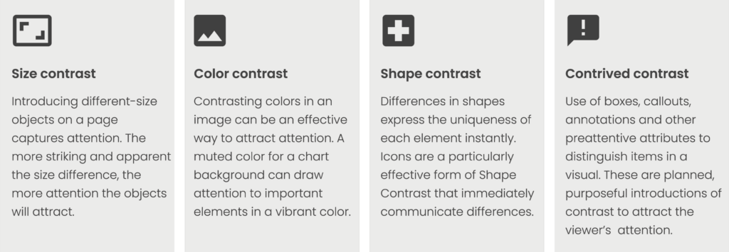
Several types of contrast improve visuals and communicate insights efficiently. Contrast takes many forms including: size, color, shape, and what we will call “contrived” contrast.
Let’s take a deeper look at each type of contrast now.
Size Contrast
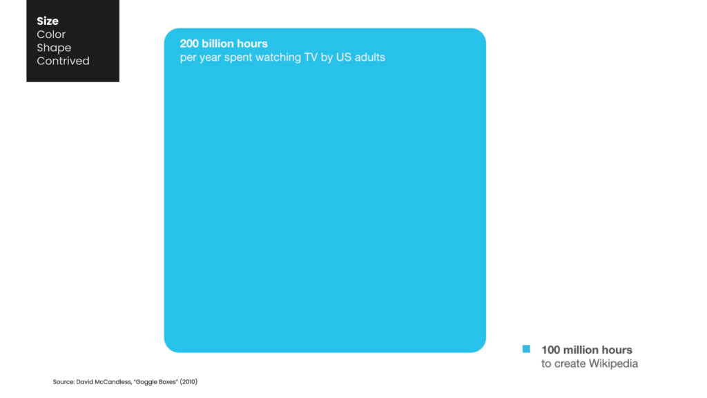
The use of various sizes of objects on a page can be attention-grabbing. The greater the contrast in size, the more likely it is that the objects will catch the viewer’s eye. This visual representation by David McCandless displays a stark comparison between the average time American adults spend watching television in a year and the time it took to create Wikipedia.
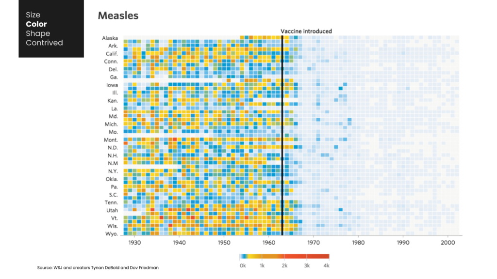
Color Contrast
Incorporating contrasting colors into an image is a great strategy for capturing attention. By using multiple colors in a chart, each object is given its own distinct identity. Color also enhances the overall visual impact of an image. When creating charts, analysts can opt for subtle background colors, such as a light gray shade, to highlight important elements with more vibrant colors. Varying levels of color saturation can also achieve this effect. The following example illustrates how a mix of muted and bold colors can create contrast and make elements stand out on the page.
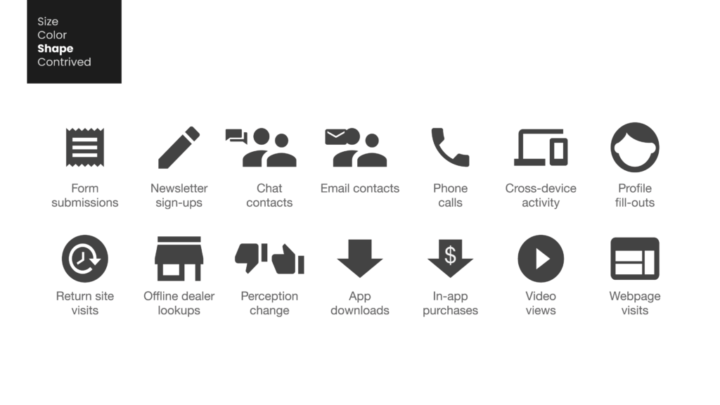
Shape Contrast
Similar to how audiences perceive differences in size and color, they also interpret various shapes within images. The use of different shapes effectively conveys the distinctiveness of each element to viewers. Icons are especially powerful in creating shape contrast, as people readily recognize that each icon represents a separate element.
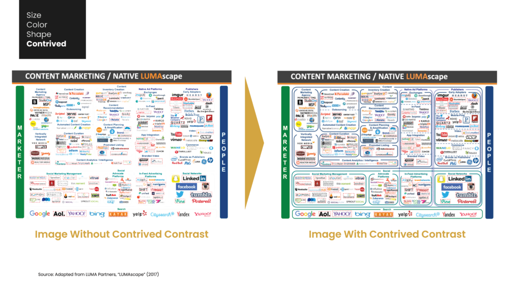
Contrived Contrast
Another form of contrast is what I refer to as contrived contrast. This type of contrast involves using boxes, callouts, annotations, and other preattentive attributes to differentiate elements in a visual. These are purposely designed techniques that draw attention to specific items. Consider implementing this approach when utilizing size, color, or shape contrast may not be feasible.
A great example of the use of contrast techniques can be seen in the series of LUMAscape charts from investment bank Luma Partners. These charts organize the complex world of advertising technology (“ad tech”) by grouping similar companies on one page. The size of each group represents the relative number of companies in that particular area of the ad tech industry. Different colored labels are used to separate each category. However, what makes these charts most effective is the implementation of contrived contrast through enclosures placed around each group (as well as boxes surrounding companies that have recently been acquired or closed down). This technique stands out and captures the viewer’s attention.
Applying Contrast in Visualizations
Incorporating these techniques of contrast into your data visualizations is not just about enhancing aesthetics, but also about amplifying the effectiveness of your visualizations. By expertly utilizing elements such as size, color, and shape in intentional contrasts, you can effectively guide your audience’s attention towards the essential components of your data, ultimately improving comprehension and retention.
Next week we will look at the second rule of effective data visualizations, ensuring clear meaning through a purposeful use of common chart elements.