Today, we wrap-up our review of the three rules for effective dataviz by learning how to minimize distractions through a refined execution of key design principles. We’ll dive into why polished visuals and meticulous attention to detail are crucial for creating data visualizations that grab your audience’s attention, effectively convey your message, and appear pleasing to the eye.
Think of refined execution as a set of guidelines that strip charts of any distractions. We concentrate on elements such as lines (including fonts, which are essentially collections of straight and curved lines), shapes, spacing, and color.
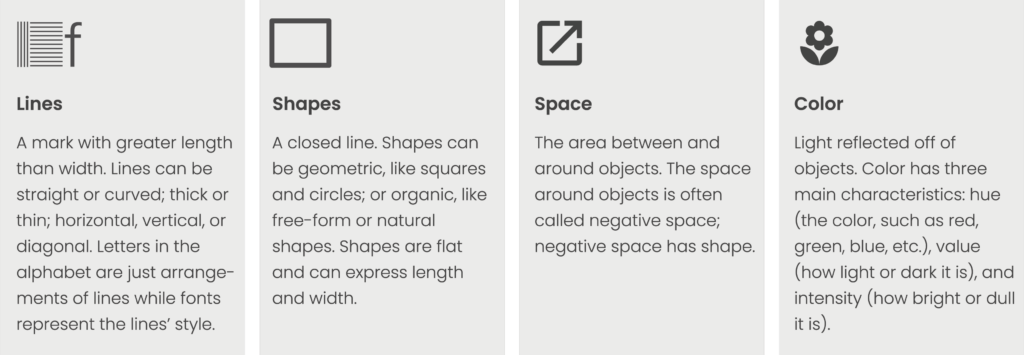
These fundamental elements of data visualizations — lines, shapes, space, and color — are derived from The J. Paul Getty Museum’s “Elements of Art,” a framework that artists use to create compelling visual compositions. By applying these principles to data visualization, we enhance clarity, impact, and effectiveness in data visualization.
However, two of the Getty Museum’s traditional elements of art — three-dimensional form and texture — are deliberately excluded when designing data visualizations. While these elements add depth and realism to paintings and sculptures, they introduce unnecessary complexity and visual noise in the context of data communication. More on that later.
Let’s take a closer look at each of these components.
Lines
When designing visuals, simplicity remains paramount. Whether you’re working on a graph or choosing a font, lines should be sleek and unembellished — avoiding extras like shadows or 3D effects that could detract from the main data. This approach helps to convey the information more directly and accurately.
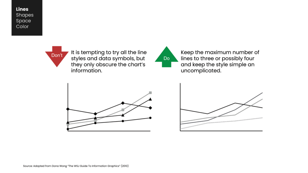
Both straight and curved lines should be kept clean and simple. This prevents a situation where the viewer’s attention is drawn away from the overall trend you are trying to highlight. Similarly, data markers on these lines can be distracting if they shift focus away from the larger trend.
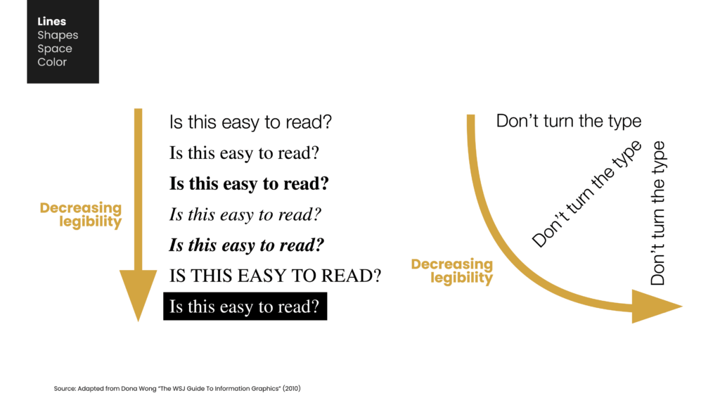
In so far as letters in the alphabet are simply a collection of lines, our choice of font plays a vital role in legibility. Thus, it’s essential to select appropriate, professional fonts instead of whimsical options like handwriting styles — or worse, Comic Sans. Although such fonts might add personality, they often render the text difficult to read and become a distraction.
Look to reputable outlets like the New York Times or the Wall Street Journal for examples of using serious, practical fonts over gimmicky ones. Analysts should aim to emulate an established news organization rather than a cartoon.
Simple sans sherif fonts like Helvetica or Arial enhance the readability of your graphs, especially when they are presented without excessive bold weights, italicized, all caps, or as jarring white text against a dark rectangular background the style known as ‘knockout.’ Furthermore, avoid rotating text in your charts. Keeping all text — especially labels — aligned horizontally, as we naturally read, ensures easy readability and minimizes distractions.
Maintaining consistent font choices throughout your presentation aids the audience in understanding the content without encountering jarring shifts in style.
Shapes
Next, let’s discuss shapes. The most efficient shapes for displaying data are those that exclude any unnecessary decorative elements that might detract from the information. In bar charts, it is critically important to steer clear of 3D rendering since it obscures the true values of data points.
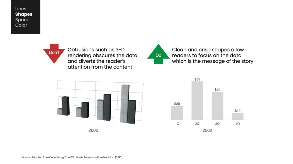
Look, just because your data visualization tool offers 3D options doesn’t mean you should use them — it’s generally unwise. Stick with clean, two-dimensional shapes that allow viewers to compare and understand the data with ease.
Similarly, incorporating textures or images into your charts — whether as part of the visual or the backdrop — only serves to conceal the data and divert the audience’s attention. The guiding principle for shapes is that anything decorative not directly related to the data has no place on your chart. The design and layout of your visual presentation significantly influence how the audience perceives the information.
Space
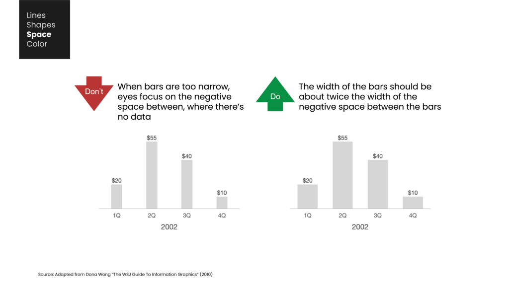
In data visualization, consistency is key to clarity. A cohesive and uniform design helps your audience concentrate on the insights rather than being distracted. When elements such as charts, icons, and spacing are inconsistent, it subtly complicates the audience’s ability to process information. Instead of grasping your message instantly, they find themselves subconsciously trying to make sense of irregular layouts, misaligned charts, and inconsistent fonts.
Recall the last report you saw where each chart was a different size, font styles varied from slide to slide, and spacing was inconsistent. Even if the data was robust, the disorganized appearance made it seem less credible.
This is why top analysts and designers ensure their visuals are consistently structured. Charts of the same type should have identical dimensions. Axes should be aligned to facilitate fair and intuitive comparisons. Fonts and colors should be uniform throughout the presentation. Even the spacing between elements is crucial—uneven margins or misaligned text boxes can make a slide appear cluttered and chaotic.
Consistency is not just about aesthetics; it enhances comparability, readability, and trust. It allows the audience to absorb insights without unnecessary mental effort. It communicates professionalism and precision. Moreover, it ensures that when someone revisits your report later—without your guidance—the meaning of your data remains crystal clear.
The most effective data visualizations do more than tell a story—they eliminate every possible barrier between the audience and the insight. Often, these barriers arise not from the data itself, but from the design.
Color
Finally, color is another crucial aspect to consider when designing visualizations.
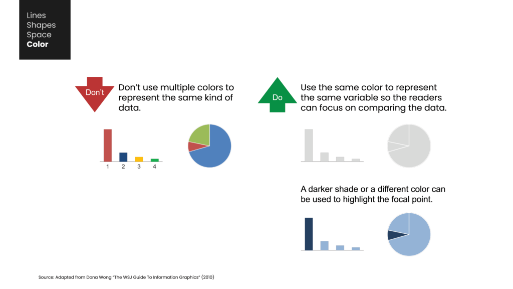
The colors you select can have a significant impact on the viewer’s perception and focus. It’s important to choose shades that not only complement each other but also provide adequate contrast. Color is often the first aspect noticed in a visualization, so examining its influence on audience perception is key.
Creating a harmonious visual relies on carefully choosing colors. This involves understanding concepts like hue, which refers to the dominant color of an object. Some hues naturally complement each other, like blue and green, while others are more contrasting, such as black and white. Using varying saturations and shades of your chosen hues can improve clarity without depending solely on stark contrasts, which might otherwise distract or overly fragment the viewer’s focus.
Another key aspect of color is its saturation and value, which determine the intensity of the color in the image. By adjusting these, you can create a range of shades that work well together. It’s also important to consider colorblind awareness—approximately 8% of men and 1.5% of women experience colorblindness. This means someone in your audience might struggle to differentiate between hues such as red and green or blue and yellow.
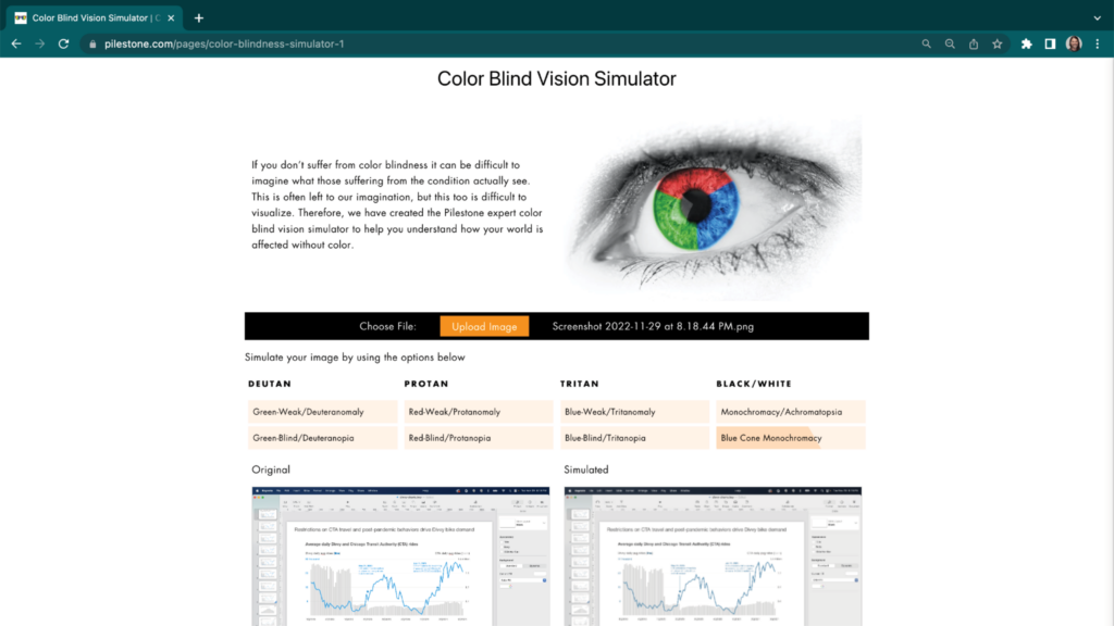
Limiting your color palette to just two or three hues, and incorporating different levels of saturation along with black, gray, and white, can make your visualizations more accessible to all viewers. There are several online tools available that let you upload your visual to see how it appears to people with various types of colorblindness — such as this online Color Blind Vision Simulator created by Pilestone.
Alternatively, you can convert your chart to grayscale to test the effectiveness of your color contrasts. If your chart remains clear in black and white and shades of gray, you’re using color successfully.
Bringing It All Together
Mastering refined execution goes beyond producing visually attractive charts—it’s about enhancing the functionality and impact of your message. By prioritizing clean lines, simple shapes, a consistent layout with ample white space, and strategic, minimal use of color, you can elevate your data storytelling to a higher level.