Oscar week is upon us, and on Sunday, March 2, 2025, the 97th Academy Awards will once again honor the very best in film. However, as Hollywood gears up for its most anticipated evening, it’s worth revisiting one of the most notorious Oscar mishaps — the 2017 Best Picture mix-up. That startling error wasn’t simply human error; it stemmed from a failure in applying principles of contrast, clarity, and precision in execution — the very guidelines that make data visualization effective.
The Best Picture award is the highlight of the ceremony, embodying the Academy’s highest honor. Yet in 2017, everything went disastrously wrong. A poorly designed winner’s card revealed that when information isn’t shown with precision, even the most revered stage can become a case study in miscommunication. This analysis delves into the sequence of events and decisions that led to the wrong winner being announced, underlining the critical importance of paying close attention to detail in visual design.
The Envelope That Changed Oscar History
On that unforgettable evening, presenters Warren Beatty and Faye Dunaway took the stage to reveal the Best Picture winner. La La Land, which had secured 14 Oscar nominations — tying the record for the most nominations in Oscar history — was the expected victor. However, it was up against a roster of exceptional films, including the brilliantly executed Moonlight.
Brian Cullinan, an accountant from PricewaterhouseCoopers (PwC), was stationed near the stage holding several envelopes. Each envelope contained the name of the award winner printed on a card designed by the Academy. For every award category, there was both a primary envelope and a backup, ready to be used if any issues arose with the main one.
Cullinan’s role, although simple in theory, was absolutely critical: he had to hand the correct envelope to the presenters. Yet, as Beatty and Dunaway approached, Cullinan mistakenly handed over the backup envelope intended for the Best Actress category instead of the Best Picture envelope. Inside that envelope, the card clearly read “Emma Stone – La La Land.”
A Moment of Hesitation, Then Chaos
When Beatty extracted the card from the envelope, it quickly became apparent that something was amiss. He began reading the card and launched into the well-rehearsed line used at the previous 88 Oscars: “And the Academy Award for Best Picture…” Then, he paused. He glanced at the card, looked offstage briefly, and then returned to the card before continuing with an uncertain “Goes to…” and then pausing again. Dunaway, puzzled by Beatty’s hesitation, chuckled and remarked, “You’re awful,” thinking her Bonnie & Clyde co-star was trying to build suspense.
Beatty then showed the card to Dunaway, who immediately spotted the anticipated movie title — the one expected to be seen in large, bold print. Without delay, she stepped up to the microphone and announced La La Land as the winner. The audience erupted into applause, and the La La Land team began their celebration as they moved toward the stage. Amid the excitement, a brief exchange between Beatty and Dunaway was caught by the stage microphone, with Dunaway exclaiming, “What?” in disbelief.
The Shocking On-Stage Correction
About two minutes later, during what was meant to be a heartfelt acceptance speech by producer Fred Berger, a commotion erupted behind him. Berger’s partner on the film, producer Jordan Horowitz, had just realized the mistake and that Moonlight was actually the Best Picture winner. Horowitz quickly took the microphone, stating, “There’s a mistake. Moonlight, you guys won Best Picture. This is not a joke.”
By then, the correct Best Picture award card had made its way to the stage. Amid the mounting confusion, Horowitz held up the card for everyone to see and confidently declared, “Moonlight, Best Picture.”
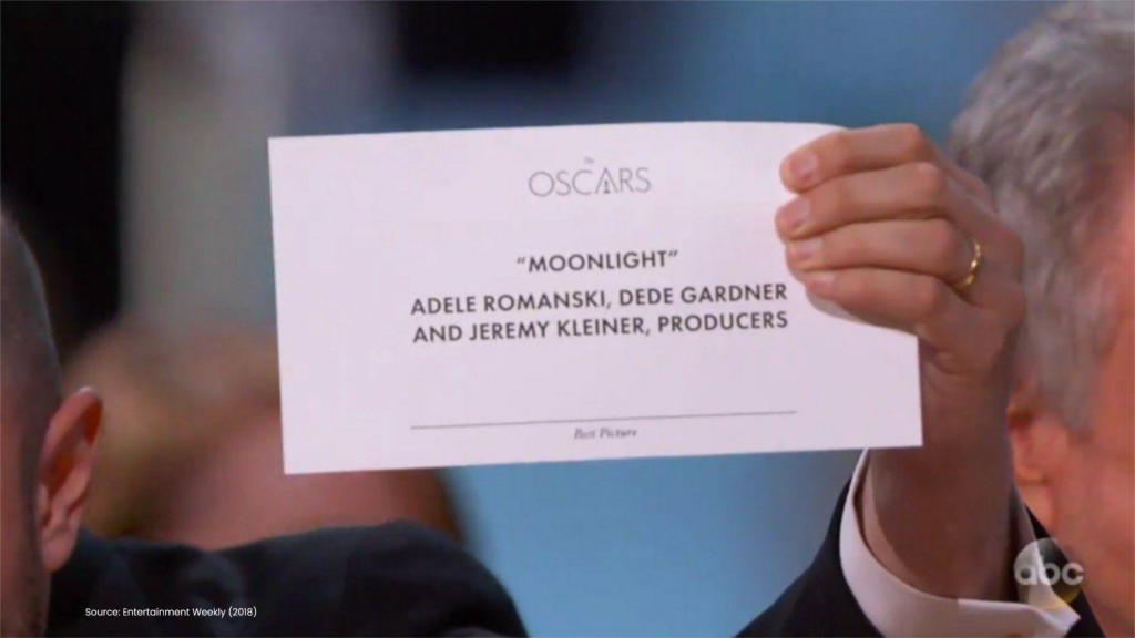
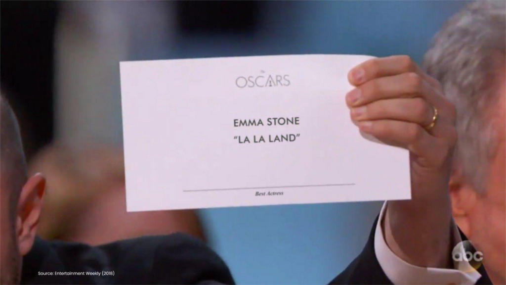
Unfortunately for Beatty and Dunaway, that wasn’t the card he pulled from the envelope they were handed. Regrettably, this card below was the one they had been given and the card that caused Beatty’s confusion:
The Real Cause: A Design Failure
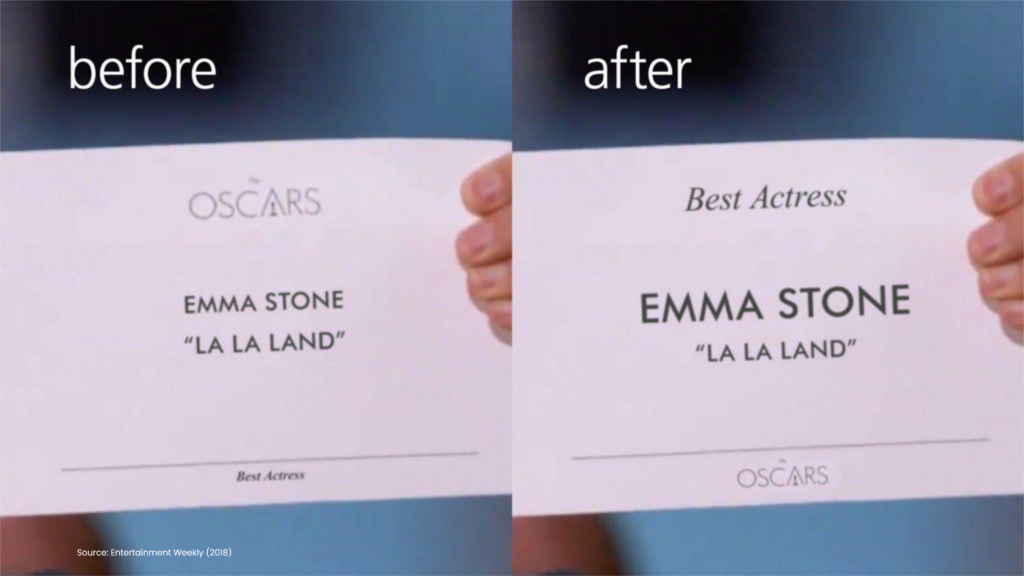
At its core, this error was a result of a design flaw. Beatty, completely innocent in the matter, was given a card that prominently displayed “La La Land” in large, bold letters in the center, immediately below the name of lead actress Emma Stone, printed in the same size and style. This visual hierarchy meant that Beatty’s eyes were immediately drawn to the film title. The stark contrast in font size and weight naturally caught his and Dunaway’s attention, leading both to focus on the name “La La Land” and assume it was the winning film.
A Lesson in Visual Communication
Our ability to process visual data is largely influenced by contrasts. When encountering text that differs in size, color, or style—or is set off by a box, highlight, or arrow—we instinctively focus on the most visually distinct elements first. The Academy clearly understood this when designing the card, ensuring that key information would be quickly identifiable by the presenters.
Yet, this principle also meant that Beatty would have immediately seen Emma Stone’s name. Although Stone was highly significant to the movie (and had just been honored with the Best Actress award before Beatty took the stage), her name did not fit the visual context likely to be interpreted as the Best Picture winner. Additionally, positioning her name above the movie title only added to the confusion. It’s easy to see why Beatty was so perplexed.
While the Academy appreciated the role of contrast in its card design, it failed to foresee a situation where the incorrect card might be handed to a presenter. The single detail that could have alerted Beatty to the error—the category text indicating Best Actress—was ironically the least prominent feature, printed in the smallest font and located at the bottom of the card. Neither Beatty nor Dunaway would have noticed this crucial detail, as it was completely overshadowed by other elements like the oversized Oscar logo at the top of the card.
If the redesigned card shown on the right had been used in 2017 instead of the original left-hand design, the mistake would have been immediately caught. The new card features larger Best Actress text in a more prominent position, which would have quickly signaled to Beatty that he had the wrong envelope. The only differences between the original and the improved design were minor adjustments in font size contrast and layout that made all the difference.
When Clarity is Non-Negotiable
The 2017 Oscar fiasco is now a well-documented example in courses covering communication, event management, and design. It underscores the vital importance of design when it comes to accurately conveying information. This incident shows how even a minor detail, such as the choice of font, can completely change the interpretation of a visual presentation. Just as contrast directs attention to specific items and basic chart elements facilitate clear meaning, visual refinement ensures that critical information stands out, while supporting details recede into the background.
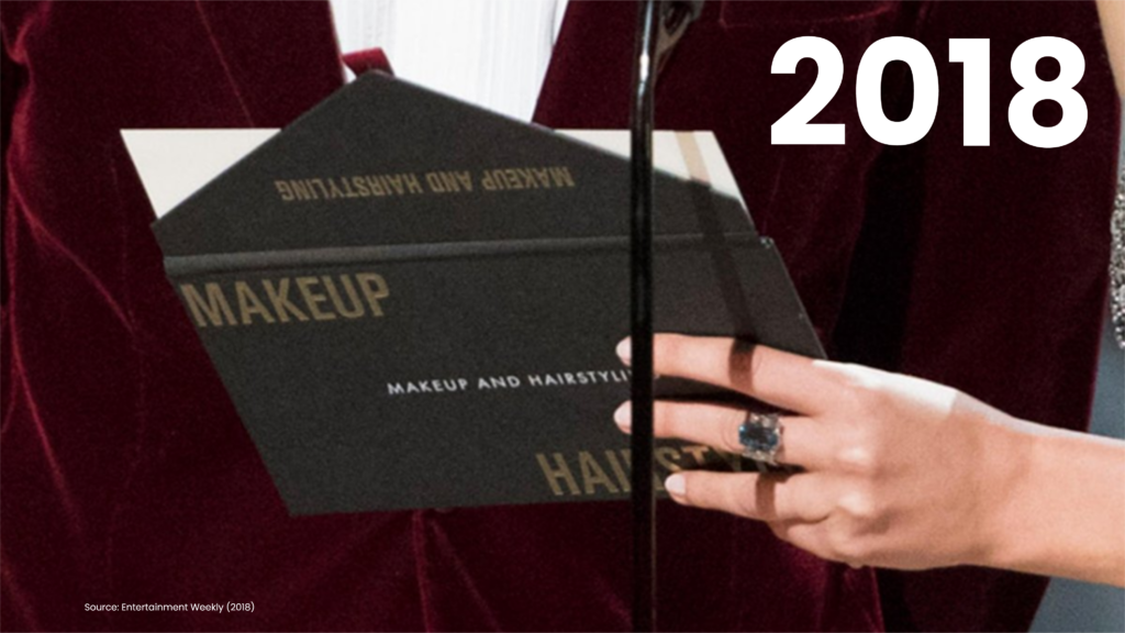
Following the envelope mix-up, the Academy drew important lessons, leading to changes in the design of envelopes and cards for future ceremonies. In subsequent years, more visually distinct and legible cards and envelopes were introduced, as evidenced by examples from the 2018 event.
The 2017 Oscar mishap has since become a key case study in courses addressing communication, event management, and visual arts. It highlights the indispensable role of effective design in conveying accurate information. This incident was not just an embarrassing mistake—it was a breakdown in the refined execution of design. In situations where pressure is high, clarity is non-negotiable. A minor tweak in font size and layout could have prevented the monumental confusion witnessed by millions.
Whether designing an award card, a presentation slide, or a data visualization, effective communication is not only about delivering the right information—it’s about ensuring that information cannot be misinterpreted.
As demonstrated, when design fails, the message does too.