

Continue reading
Last week, we focused on the weight of evidence, ensuring that every pillar of your story stands upon robust supportive data. You are now prepared to deliver a complete, compelling story that draws your audience in, hits all the right notes, and elegantly carries the weight of its proof. But your presentation does not stop […]
April 22, 2026

Continue reading
Last week, we discussed the Key Line, the structural foundation that supports your Main Message. These pillars provide the clinical logic required to move an audience from being interested in your narrative to convinced that your recommendation is the right next step for them. However, a structure without substance is an empty shell. To turn […]
April 15, 2026

Continue reading
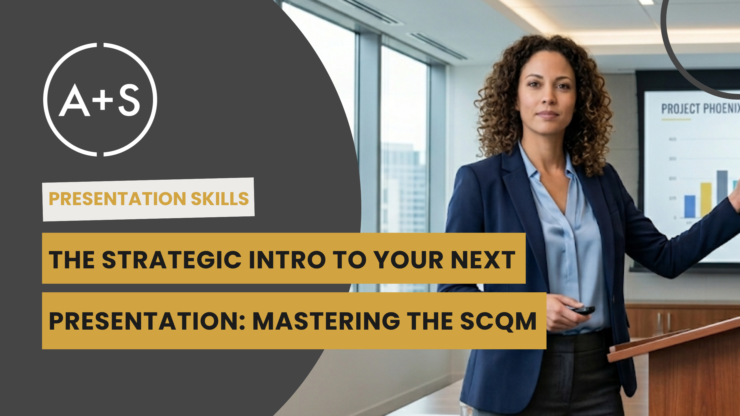
Last week, we mastered the SCQM introduction to establish a story’s hook. This narrative in a nutshell ensures your audience is ready to hear more, but a hook without substance is a hollow promise. The transition from the hook to the proof is where many analysts struggle, reverting to a data dump that undermines their […]
April 8, 2026
Continue reading
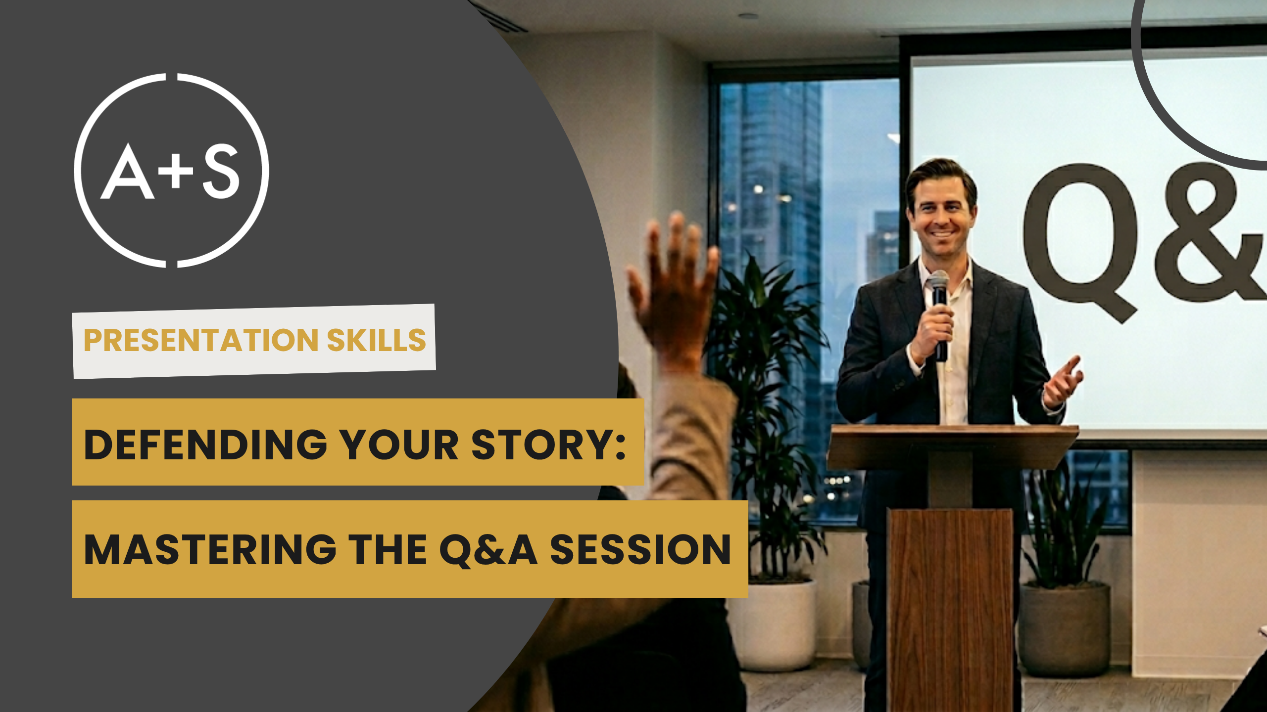
Last week, we explored the clinical diagnostic required to find the “Ask Behind the Ask.” Once you unmask the true business problem, your biggest challenge shifts from discovery to persuasion. Yet even the most rigorous analysis often fails to ignite action because of poor structure, rather than insufficient insight. When the analysis is complete, many […]
April 1, 2026
Continue reading
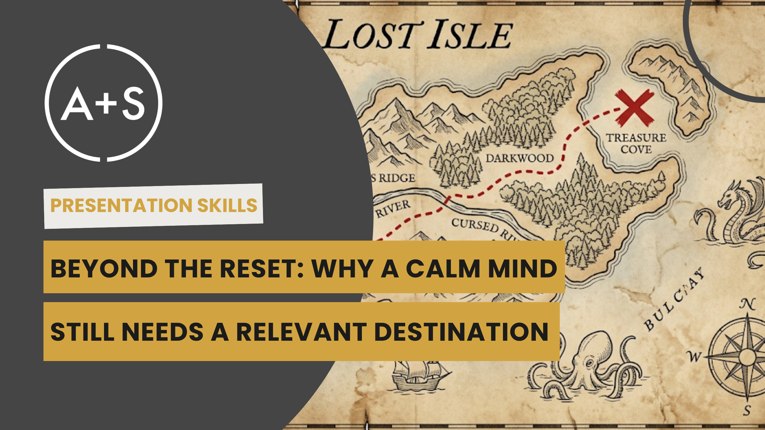
Last week, we established that achieving the Triple-C Flow State (Comfortable, Competent, and Confident) is the goal for presentation performance. We explored the biological “Hardware Failure” of speaker anxiety and the COAP Protocol required to keep your prefrontal cortex online. However, a more subtle trap exists that even poised presenters fall into: the “Relevance Gap.” […]
March 25, 2026

Continue reading
Since the dawn of civilization, storytelling has served as our most potent tool for connection, education, and persuasion. In our modern business landscape, where data is the primary currency, the ability to communicate stories is what separates a mere “number cruncher” from a true strategic analyst. Narratives establish empathy, improve retention, and ignite action. However, […]
March 18, 2026

Continue reading
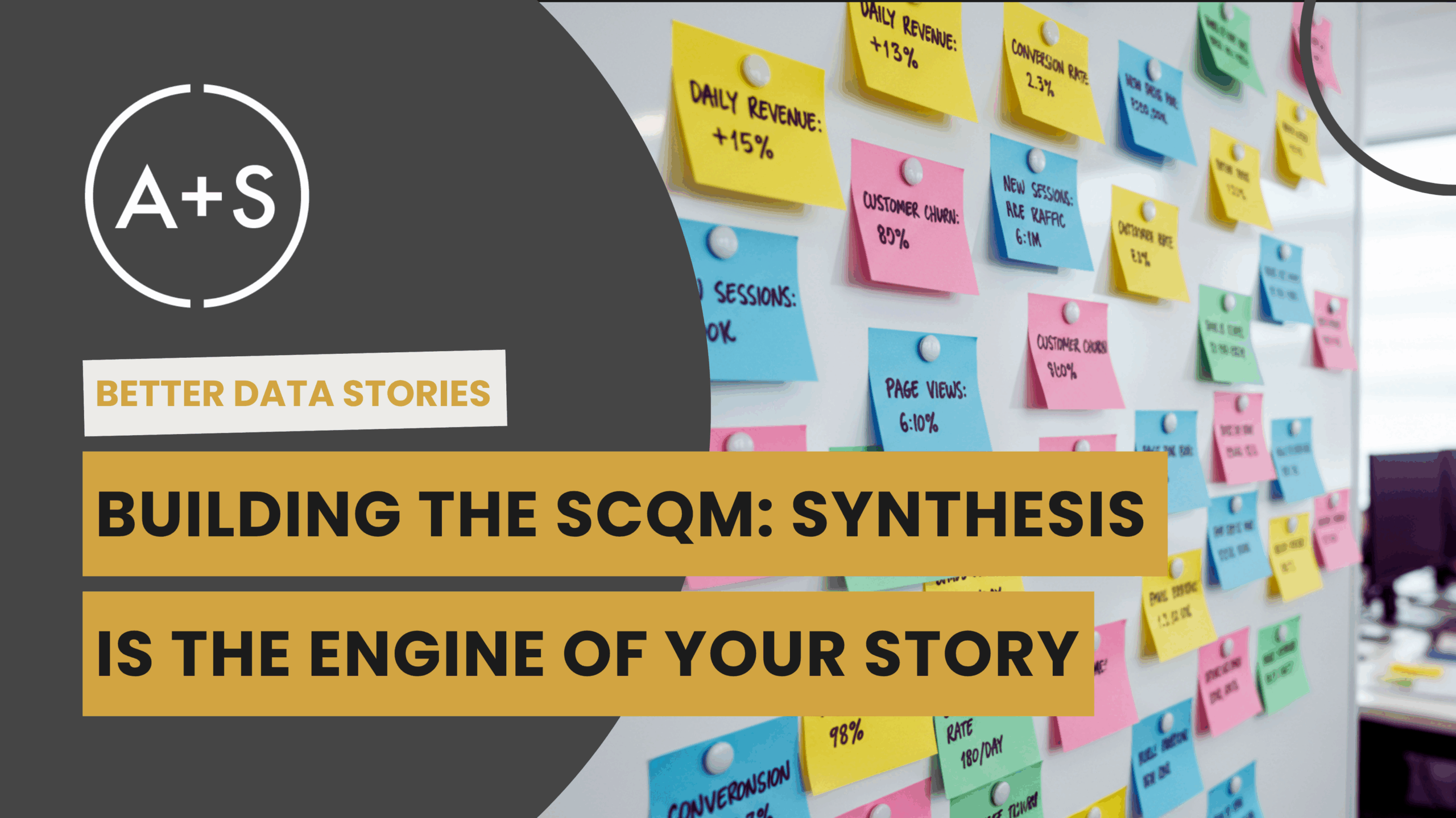
Last week, we built the engine for data-driven storytelling. We connected the SCQM framework—Situation, Complication, Question, Main Message—to the deep work of synthesis that creates it. You learned how to produce tension and provide its release by finding the Complication (C) and the Main Message (M). You now possess a powerful structure for communicating your […]
October 29, 2025
Continue reading
Last week, we buried the False Hierarchy. We exposed the myth that presenting the story of our analytical journey is persuasive—our data sources, our methodology, our “kitchen tour.” It is not. It is a slow, dull, confusing narrative that quickly and inevitably kills our stakeholders’ attention. We replaced it with a simple framework: the SCQM—Situation, […]
October 22, 2025
Continue reading
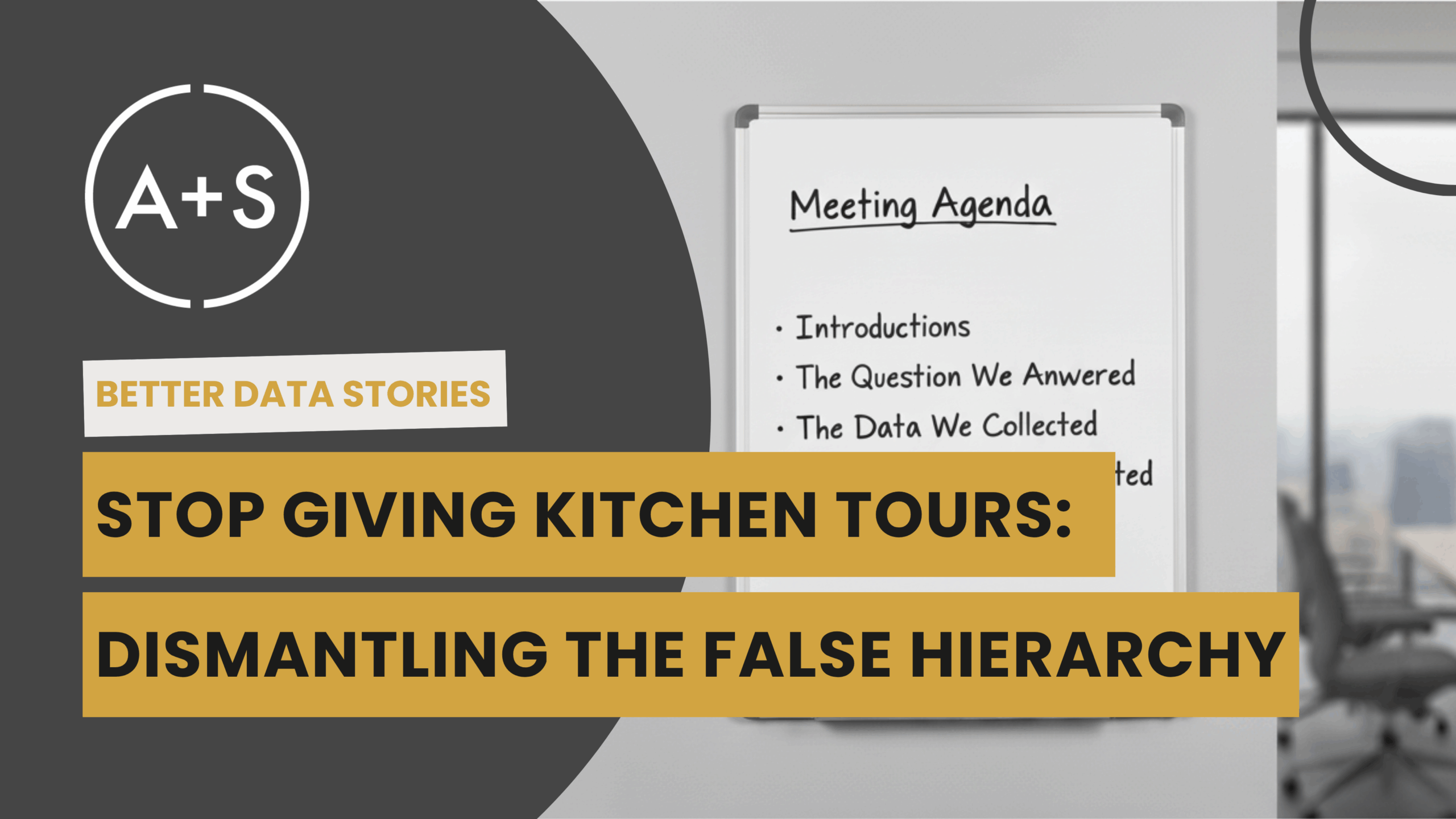
Imagine you’re a stakeholder. You jump onto a Zoom call about an analysis you asked for last week. An analyst begins to present. They start with the business question—which you already know. Then they walk you through their methodology, their data sources, and their cleaning process. Ten minutes are gone. You are being given a […]
October 15, 2025
Continue reading
The most dangerous assumption in data analytics is that rigor equals value. We’re taught that the more complex our model, the cleaner our data, and the more comprehensive our dashboard, the more valuable our work becomes. We’ve been trained to show our work meticulously as we build our unassailable case of proof. This is a […]
October 8, 2025


Download your comprehensive 6-month roadmap to equip you with the necessary skills and expertise to become a proficient data analyst candidate and succeed in the field.
Getting Your Data Analyst Career Up And Running: Your 6-Month Starter’s Guide
download


